10 Ways To Make a Gallery Wall Work
There’s something enticing about a grouping of art or photographs. A compendium of pieces brought together in one spot is interesting. It draws the eye and it shows forethought: someone had the curating skill to create a harmonious, meaningful composition. Think that’s not you? Of course it is. No matter what your collection consists of, or what type of home you have, there are lots of ways to display your favorite pieces together. Here are just a few.
1. Fit the space you have: Even a small portion of a wall can work as a gallery. (Look at how that circular mirror at the bottom fits so perfectly into the curve of the banquette back.)
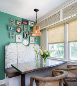
Photo: Paul S. Bartholomew, Design NJ October/November 2016 | Design: Barbara Fina, Allied ASID
2. Include similar, but different pieces: This color study is far greater than the sum of its parts. Displayed singly, these pieces would never work. As a group, they add interest to the room.
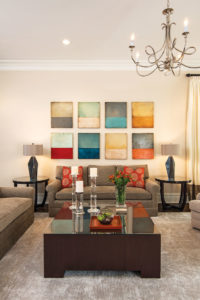
Photo: Marisa Pellegrini, Design NJ December 2017/January 2018 | Design: Tere Besin, ASID, CID
3. Make it personal: Got a hobby or favorite vacation spot? There’s your grouping! Take photos, match up the frames and you’ve got a professional-looking collection with special meaning.
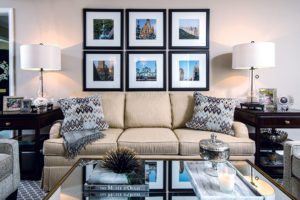
Photo: Marisa Pellegrini, Design NJ April/May 2016 | Design: Libby Langdon
4. Find A Commonality: These pieces—with diverse subjects, frames and sizes—work together because they share similar colors.
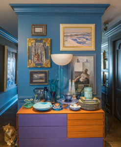
Photo: Patricia Burke, Design NJ February/March 2016 Art: James Yarosh Associates Fine Art Gallery
5. Remember the good old days: Effortlessly combine vintage photos with recent ones by converting new images to black and white for a uniform look.
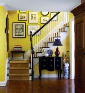
Photo: Laura Moss, Design NJ June/July 2015 | Designer and Stylist: Jennifer Vreeland McDermott, Allied Member ASID
6: Don’t use pictures at all: This sculptural metal orb display makes for quite the conversation piece.
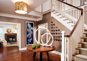
Photo: John Ferrentino, Design NJ August/September 2015 | Interior Designer: Tracey Butler
7. Make it orderly: Group similar pieces in tidy rows.
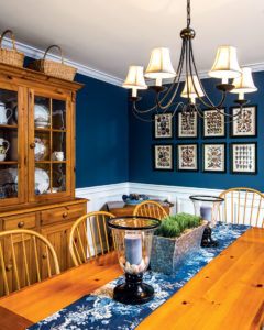
Photo: Marisa Pellegrini, Design NJ February/March 2015 | Designer: Richard Scuderi
8. Or don’t: Pick a focal point for the center of the grouping. Then circle it with the rest of the pieces.
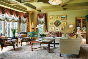
Photo: Peter Rymwid, Design NJ December 2013/January 2014 | Designer: Karla Trincanello, CID, Allied Member ASID
9. Work with the architecture: Notice how the wall at right is subtly curved? A single large piece would never work there. But a series of smaller pieces fill the wall while lying flat.
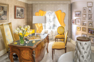
Photo: Patricia Burke, Design NJ June/July 2014 | Designer: James Yarosh
10. Go easy: Picture hanging skills not up to snuff? Don’t hang at all; lean. You’ll be able to rotate your “exhibits” with minimal fuss.
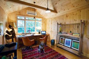
Photo: Melabee Miller, Design NJ February/March 2016 | Designer: Melanie Sobash, Allied Member, ASID
Builder/Contractor: Salmark Construction
