A Mendham Home Displays a Wide Array of Colors
Writer Marirose Krall | Photographer Victoria Alfonzo | Designer Jean HerronSome are dynamic; some are discreet
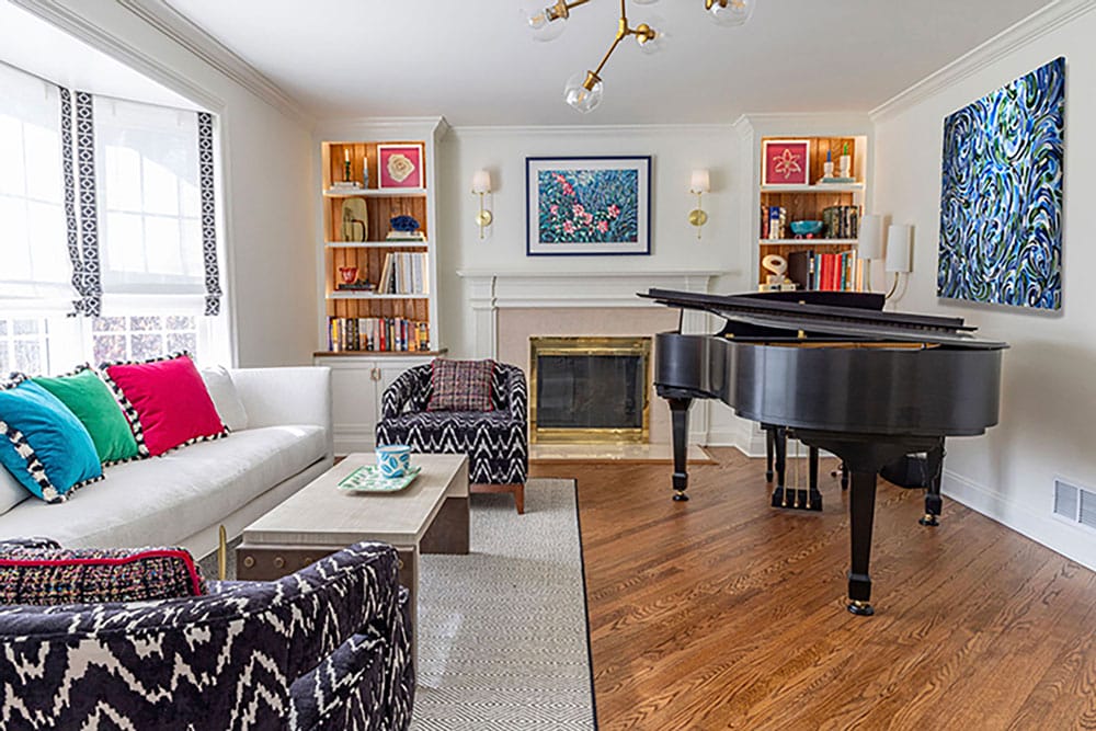
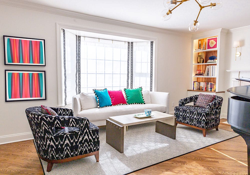
“The design incorporates bold, highly saturated fabrics, adding vibrancy and movement to the space while ensuring a visually engaging atmosphere,” designer Jean Herron says of the music room. “Modern lighting fixtures were carefully selected to create an immersive experience, highlighting key areas such as the grand piano — the centerpiece of the room — and illuminating performance moments with dramatic effect.”
The previous Country French interiors of this Mendham home had had their day. “While charming, the décor had become dark and heavy over time,” says Jean Herron of Morristown-based Jean Herron Design LLC. “The homeowners sought a transformation — one that embraced color, light and modern elegance while maintaining a sense of warmth and comfort.”
Embracing color can be difficult, Herron says. “A lot of people want to use color but they’re not confident.” These homeowners, though, trusted in the designer to imbue their home with hues that would reflect their new aesthetic — and that would be calibrated to the purpose of each room.
“A way to give a room energy is to use huge variations of tone or very saturated colors. So we did it all,” Herron explains. “It’s not very often that you can use fuchsia. It’s such a great color .”
The music room was particularly important. “They are all super musical,” Herron says of the family. “So this space was designed to be dynamic and inspiring to reflect the family’s deep passion for music.” The owners were looking for more than a redesign in this space; they also wanted a vibe shift. “They wanted an environment that not only serves as a practice and performance venue but also enhances the energy and creativity of their musical expressions.” To that end, Herron accented the space with robust colors. Throw pillows in primary hues pop against the white sofa, which is flanked by two armchairs upholstered in a deep blue and white ikat-patterned fabric.
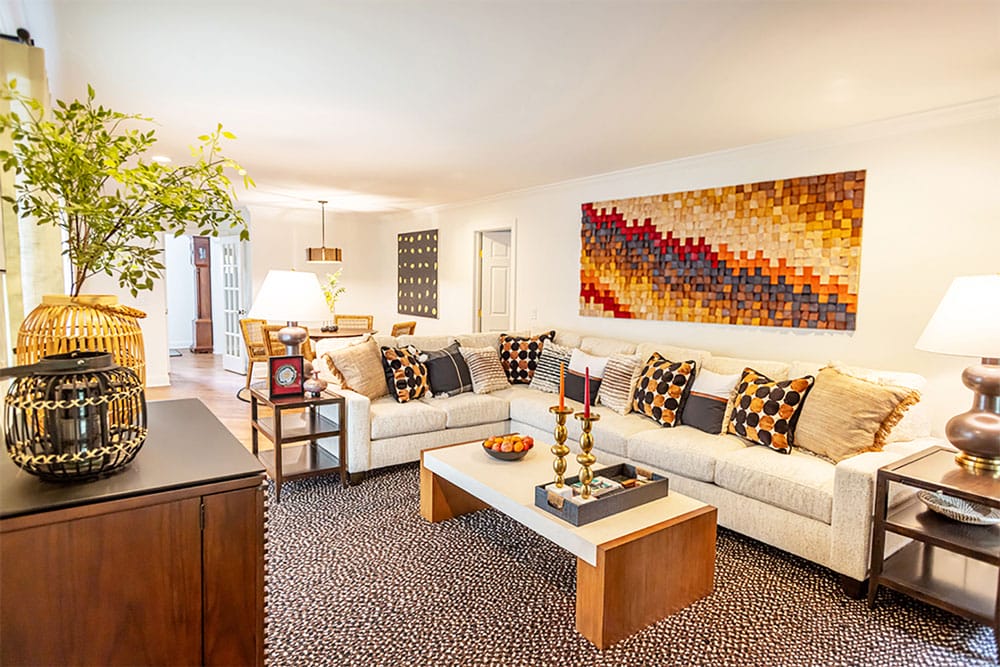
Autumnal colors accent the cozy family room.
The most colorful parts of the room, though, may be the walls, where ebullient artwork brings injects a joyful ambience. “The art pieces were integrated to reinforce the expressive and artistic nature of the room, serving as both inspiration and a visual representation of the music that fills the space. Together, these elements create an atmosphere that is both exhilarating and intimate, making it a perfect setting for both practice and performance,” Herron says.
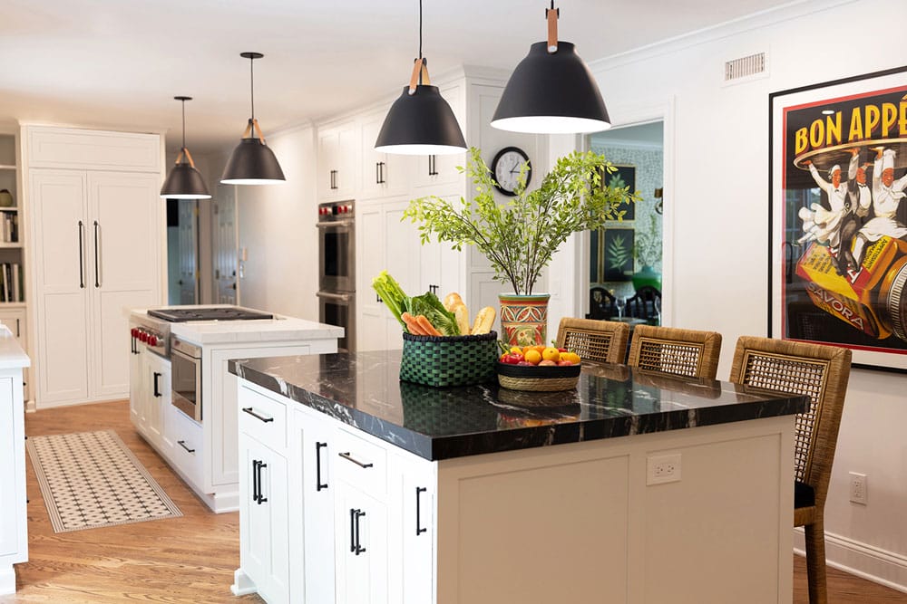
The black and white kitchen gets a pop of color with a vintage Savora mustard advertisement. Two different island tops — one white and one black — keep the look fresh. A remnant from the black countertop was used as a new top for the dining room console.
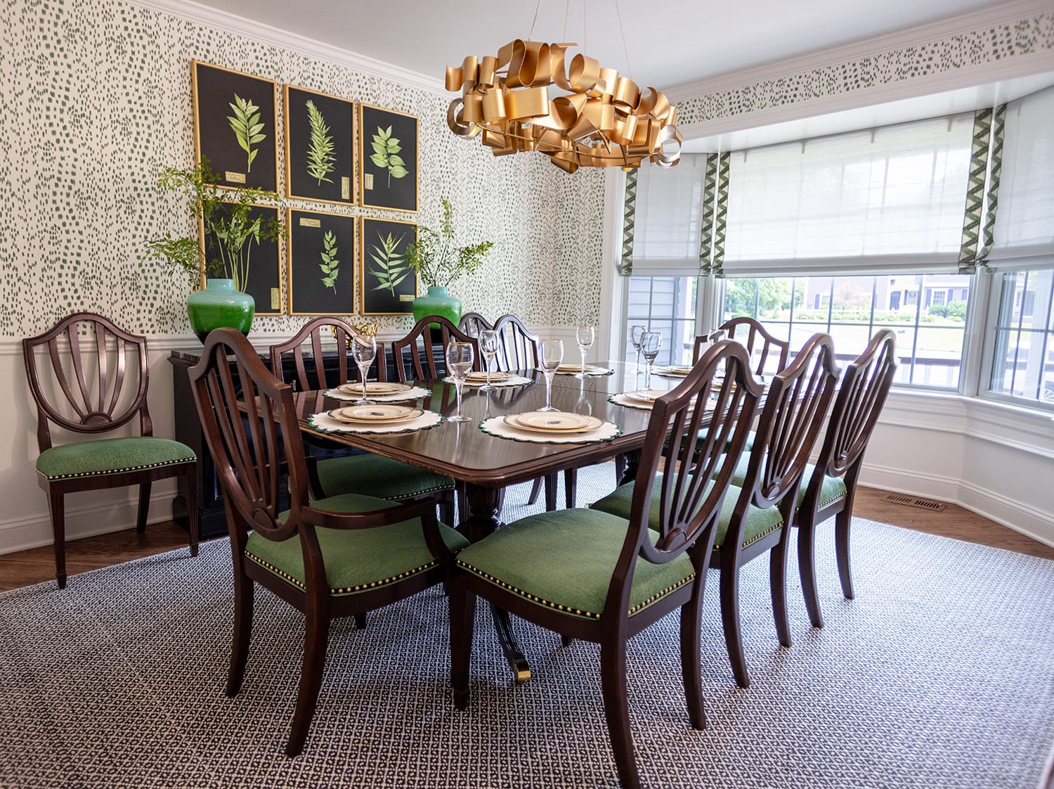
“The redesign of the dining room embraces sustainability by repurposing existing furniture. The dining chairs have been refreshed with intricate new details, adding character and elegance,” Herron notes. “Meanwhile, the sideboard has been transformed with a sleek black lacquer finish and updated hardware, aligning it with the room’s updated aesthetic.”
Herron chose an entirely different color scheme for the family room. “I used an autumnal palette,” she says. The warm, rich tones bring coziness to the space. A variety of geometric patterns in the artwork, rug and throw pillows keep the look interesting. The dining room has an ecological flair, with green accents against a deep wood table, chairs and console. “The dining room’s design is anchored by a saturated green,” Herron notes. She reupholstered the homeowners’ existing dining room chairs with chenille fabric and added gold nail heads for contrast. The gold accents on the seats coordinate with other accents in the room. For instance, a sextet of botanical prints above the console are framed in gold. A striking chandelier above the table takes showstopper status with its jumble of ribbon-like gold strips snaking along a circular base. “The clients were open to doing very modern statement light,” the designer shares.
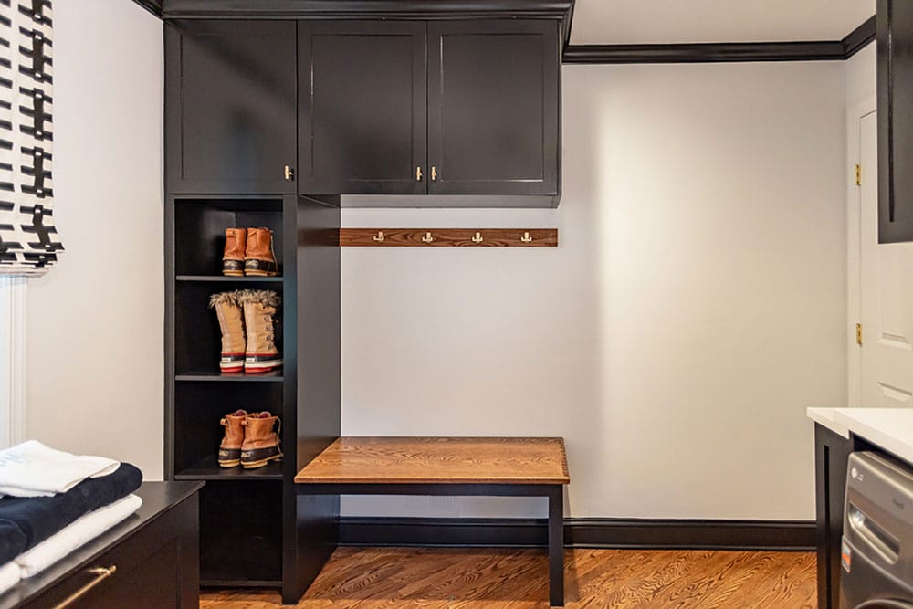
“We basically gutted the room,” Herron says of the laundry room. It now features built-in black cabinetry that matches the accents in the adjoining kitchen.
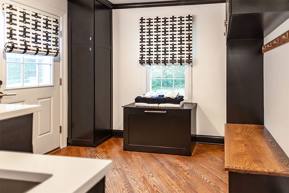
Black and white window treatments coordinate with the cabinetry in the spacious laundry room.
Color plays a role in the primary bedroom as well, but in a much softer way. “The aesthetic is designed to be a serene retreat, balancing a calming atmosphere with a sense of freshness and vitality,” Herron explains. “The aqua color scheme plays a key role in establishing this mood, as shades of blue and green are naturally soothing while also evoking a refreshing, invigorating feel.” The design plan has been successful. “The client tells me she wakes up feeling really well-rested. The room has a super cosseting, relaxed vibe, but there’s also a fresh, clean, energy and vitality about it.”
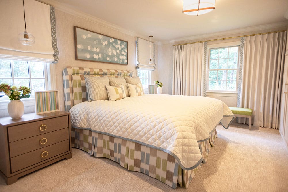
“A focal point in the primary bedroom is the artwork over the bed, which depicts the reflection of light on water. This not only reinforces the water-inspired theme, but also adds depth and movement to the space,” according to Herron. “The way light interacts with water creates a sense of fluidity and relaxation, mirroring the desired ambience of the room.” Pendant lights on both sides of the bed keep the side tables free for creative displays.
These homeowners, with Herron as a guide, have seen firsthand the way color can influence our lives. “They are the dream clients,” Herron says. “They trust me, so I feel more inspired. Once they trust you, they can really go out of their comfort zone because they know their home is going to look beautiful.”
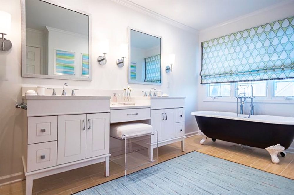
Herron designed the primary bathroom window treatment fabric as well as the artwork on the walls (reflected in the mirrors).