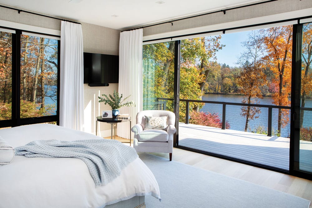
A Princeton Home Takes Advantage of the View
Writer Marirose Krall | Photographer Tom Grimes | Designer CJ Mapletoft and Dana Miller | Architect Louisa Bartle Clayton, AIA | Location Princeton, NJThe reworked layout centers on the scenery
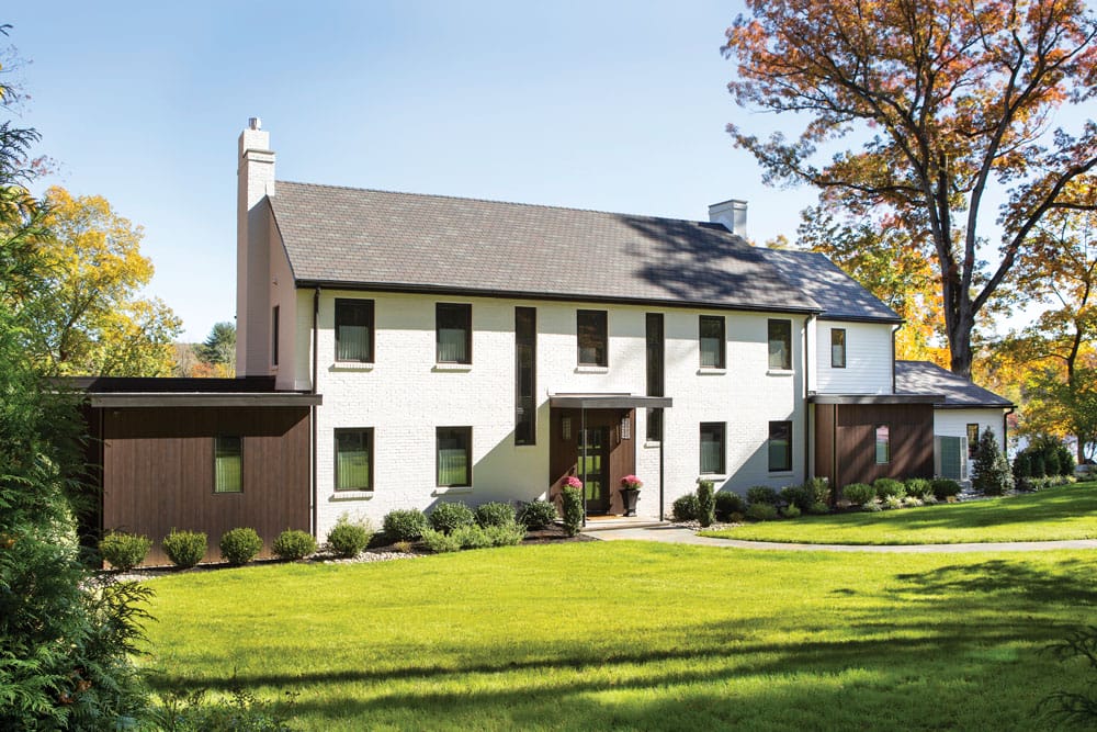
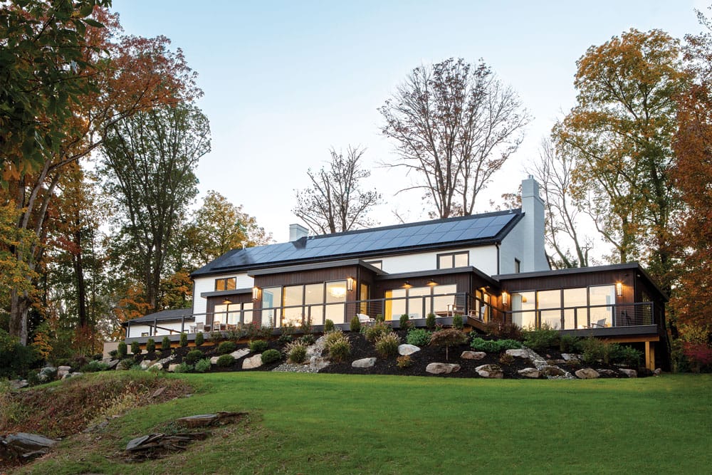
“The additions are like two exclamation points protruding from the front of the house. They offer a nice juxtaposition with the brick and white siding. And the dark wood complements the landscaping,” architect Louisa Bartle Clayton says.
Upon seeing this property, the owners were taken with the location. That’s no surprise — the site is stunning, situated as it is on a promontory above Lake Carnegie in Princeton. But the interiors of the existing 1980s Colonial-style residence didn’t take full advantage of the enviable location. “The layout of the original home was not oriented toward the lake,” says Louisa Bartle Clayton, a member of the American Institute of Architects and owner of Princeton-based Bartle Clayton Architecture. “The house could have been anywhere; it didn’t speak at all to this beautiful piece of land.”
Design NJ: How did you redesign the layout to maximize the panorama?
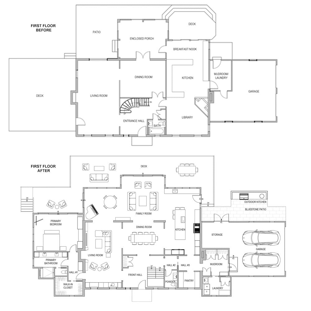
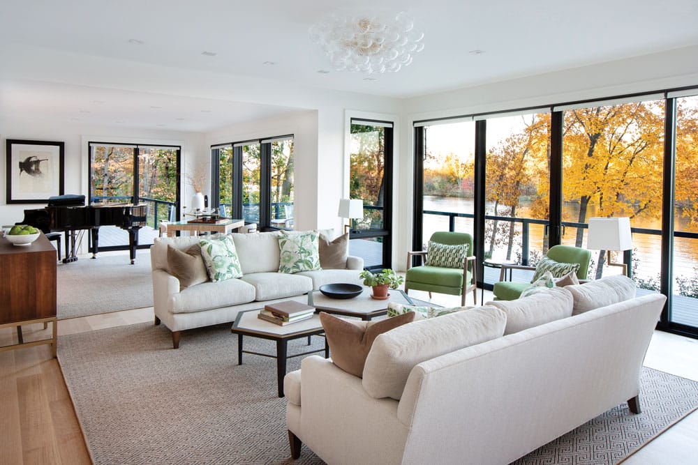
LBC: The first time we walked into this house, we immediately saw that the staircase was blocking the view. We relocated it to the side of the front door so the lake is visible from the entryway. That’s the money view. We removed an old deck and created an addition that pushes the house toward the lake. That extra space allowed us to enlarge the kitchen and add a sitting room and a music room at the back of the house. To ensure that nothing compromised the views, we added floor-to-ceiling windows in these spaces.
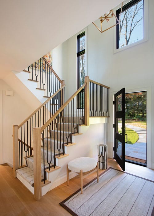
The stairwell was originally located in the center of the foyer. Bartle Clayton relocated it to the side to create sight lines from the entry to the backyard.
We retained the old living room and enlarged the cased openings to the adjacent dining and music rooms. The living room is a cozy space that’s farther away from the kitchen, so you can sit there quietly, feeling connected to those in the kitchen but not in the middle of the party. I think that’s one of the most beautiful things we’ve created here — the ability to set yourself apart while retaining a feeling of openness, communication and easy circulation.
DNJ: What changes were made to the exterior?
LBC: The original structure’s brick siding was in great shape, so we kept it. However, the homeowners don’t like red brick, so we painted it white. We replaced all the windows with double-paned insulated glass casement windows that have a black exterior finish.
For practical and aesthetic purposes, I designed two small additions located on either side of the front door. Local zoning ordinances require a certain setback of the garage as it relates to the front façade of the house. The existing house was built before the rule was in place but, because we were doing extensive renovations, we were bound by it. These additions offered us a way to achieve that setback without having to request a variance. They gave us the required setback to the garage and provided interior space for a laundry room and a walk-in closet.
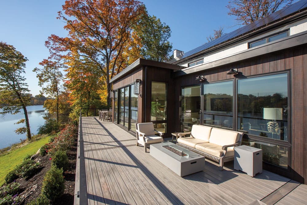
The additions on the back and front of house are clad in a thermally modified wood siding. Bartle Clayton says, “Its moisture content is low and it’s treated with a low-VOC oil finish that helps maintain the color and makes it rot- and insect-resistant.”
DNJ: Were there special considerations involved when outfitting a home in this location?
LBC: Water management was a major concern. When we first began work on-site, we found that the grading had been poorly designed so water collected in the front yard, the foundation wall hadn’t been waterproofed and the basement was damp. To address the issue, we excavated the foundation wall, waterproofed it and added footing drains to direct water away. We rebuilt the front path from the driveway to the front door so storm water flows away from the house. We were able to dry out the basement. Now the homeowners use it with confidence as a home gym, storage space and mechanical area.
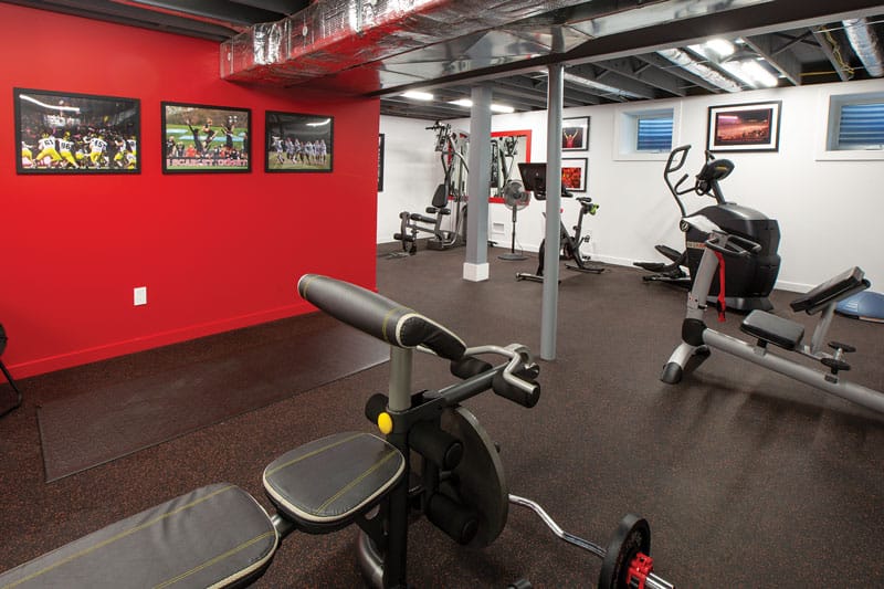
By diverting water and waterproofing the foundation wall, Bartle Clayton was able to prevent moisture from entering the basement. The homeowners have a gym in the now-dry space.
DNJ: What role did energy conservation play in the project?
LBC: I’m always focused on energy efficiency in every aspect of a build. At this home, the initial portion of the project involved bringing the house down to an empty shell. We removed the HVAC, plumbing and mechanical systems and replaced them. We reinsulated the entire house to create a tight exterior envelope and replaced the windows with double-paned insulated glass casements, which give a really nice seal. Now the house maintains very consistent temperature and humidity levels throughout the seasons. All lighting is LED. To top it all off, there’s a solar array on the roof, generating much of the electricity this house needs to operate and sending electricity back to the grid, making the whole neighborhood cleaner.
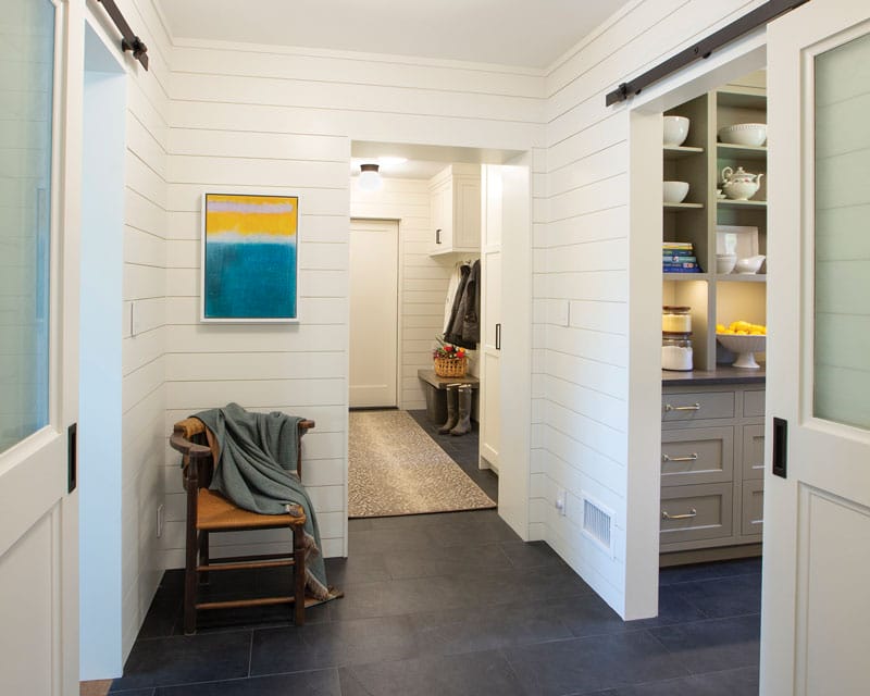
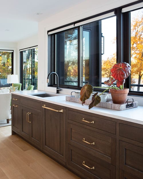
“We expanded the garage,” Bartle Clayton notes. “This allowed us to create a mudroom space between the house and the garage.” Bartle Clayton designed all the cabinetry in the residence.
DNJ: How does the finished project differ from the original home?
LBC: The style is much more contemporary, but it still retains the original gable roof and the chimney. So there’s evidence of what it had been, and now you can see what it’s become. The house grew up. It’s more beautiful than we could have ever imagined.
EDITOR’S NOTES: For more on this home’s interiors, see “Pleasing Panorama” in our October/November 2024 issue.
This story originally appeared in the December 2024/January 2025 issue of Design NJ under the headline “View Finder.”
For more architecture stories, click here.

