An Englewood Split Level Gets a Makeover
Writer Marirose Krall | Photographer Marisa Pellegrini | Designer Felicia Zwebner | Architect Robert Gross, RA, AIA, LEED APThe new spaces showcase the homeowners’ art collection
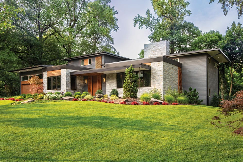
“The massing of the house is very horizontal,” architect Robert Gross says. “Outside, we featured gray wood siding treated using the Shou Sugi Ban method, a Japanese process for scorching wood to create a charred surface. It serves as a mechanism to promote rot- and insect-resistance. It offers better protection than stain or sealant. And the process highlights the wood’s own grain in dramatic ways.
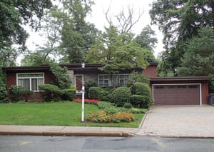
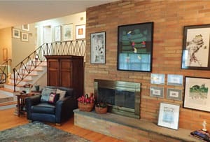
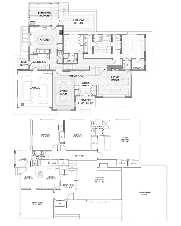
BEFORE: Gross relocated the garage from the right-hand side of the house to the left. “It made no sense where it was,” he says. “The former location was to the right of the living room on the lower level, so you had to carry groceries across the downstairs family room and up a half-level to get to the kitchen.” The new garage opens directly to the mudroom next to the kitchen.
The owners of this Englewood, Bergen County, home had recently relocated to be near family. They wanted a place where they could entertain their children and grandchildren while retaining their independence and their privacy. This residence filled the bill, though it required a bit of updating. To bring the structure more in line with their tastes, the homeowners brought in architect Robert Gross who, at the time, was an associate principal at Manhattan-based SKOLNICK Architecture+Design Partnership. (Gross now heads his own firm, Robert Gross Architecture in Englewood.) To assist with the interior design, they turned to Felicia Zwebner, principal and CEO of Englewood-based Felicia Zwebner Design and founder of FZ Collection, a custom furniture line.
Design NJ: What is the style of this home?
Robert Gross: The existing house is a 1950s front-to-back split level. However, the house isn’t experienced as a split level because the public spaces — living room, dining room and kitchen — are on the main level, with a family room and office half a level below and bedrooms half a level above.
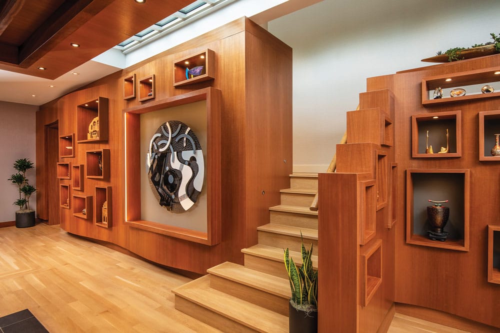
“The most important central feature is the ‘ribbon wall’ which extends the entire width of the house,” designer Felicia Zwebner says. Gross adds, “It greets you as you enter the residence and leads you through the space.” Each niche was sized for the art piece it holds.
Even the way the levels relate to each other differs from a traditional split level. We pulled each half level of staircase away from the others so there is no core stairwell in the house. [Editor’s Note: The staircases to the lower and upper levels are located behind the ribbon wall.] This accentuates the almost-ranch-style way one moves through the house. Movement is primarily horizontal. One moves vertically only half a level at a time; there are no stairs immediately to the next flight up or down.

Wood beams in the foyer (behind the gray wall) are a continuation from the exterior entry. “A low ceiling brings you into the foyer,” Gross says, “and then you’re released into a brightly lit space with a higher ceiling.” Zwebner specified performance fabrics for the furnishings. “I think it’s important to survey clients and understand their needs and living style,” she says. “These homeowners told me they were planning on having at least two dogs. They’re also grandparents, so I proposed fabrics that would hold up.”
DNJ: What were the homeowners looking for in the remodel?
RG: They came to me expressing an appreciation for Frank Lloyd Wright. I wouldn’t try to emulate Wright, but that’s the perspective from which we approached this home. It’s a Prairie-house sensibility that follows the landscape and doesn’t project much to the front or back. They wanted this house to be ‘demure’ on the outside but open up to generous interior spaces. They have a modest, Midwestern sensibility; keeping the front elevation relatively low and discreet is a projection of their personality. Inside, they wanted all the main spaces to be contiguous and open to each other.
DNJ: What was the scope of the project?
RG: It was technically a renovation. We kept the actual foundation of the house, which set the footprint. Over the kitchen, at a rear corner of the home, we added a partial second floor comprising two guestrooms. We shifted the garage from one side of house to the other for easier access to the mudroom and kitchen.
A split-level arrangement is a very efficient house typology, but it doesn’t provide a lot of natural light. So we worked hard to bring in natural light and minimize the often cut-up feeling of this type of house. We tried to make it feel gracious in its layout. The original, ungenerous rooms were much darker. We selectively removed walls and added clerestory windows along the primary wing corridor wall as well as a broad skylight above the ribbon wall.
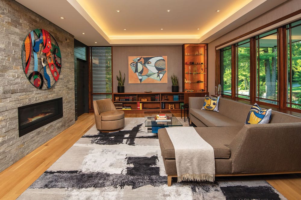
“The clients expressed an appreciation for natural materials, such as wood and stone,” Gross says. The new fireplace wall features the same stone used on the exterior. The art over the built-in shelving is by late actor Anthony Quinn.
DNJ: What was the inspiration for the wood-paneled walls with the niches?
RG: That is another main programmatic objective the clients had. They have a great art collection. Most of it is very dynamic and is made to be seen from different perspectives. We knew they could energize any space they were in and could be some of the most important organizing visual elements of the house. We considered the idea of the wall itself as art. The art and the wall that holds it play off each other because the pieces are hard-edged and geometric and faceted, while the wall became a curving feature. We started calling it a “ribbon wall.” It undulates through the house and celebrates the art the clients spent years collecting and curating.
DNJ: How did the homeowners’ art collection inform the interior design?
Felicia Zwebner: Meeting with the homeowners, I realized how important the art is to them, so I let that dictate the design. Robert and I conceived of the ribbon wall idea to showcase their collection. I wanted the rest of the furnishings to be comfortable and inviting without calling attention to themselves.
The whole feel of the house is contemporary. So we incorporated furniture along those lines, with organic shapes and natural earth tones. We didn’t want to overwhelm the space, so we used low-slung furniture that echoes the low ceilings. The overall aesthetic reminds me of Ayn Rand, who wrote “The Fountainhead”—a story about modern architecture in the 1920s and ’30s—or Frank Lloyd Wright.
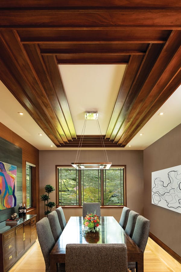
“As much as the main spaces in the house flow, ultimately, the dining room wants to be a place of repose where you stop. We created an anchoring element over the table, using the same beautiful wood that we used for the ribbon wall, but doing it in a much different way.” The art above the console is by late actor Anthony Quinn. The dining chairs were the clients’ own. Zwebner had them reupholstered to be more in line with the new design of the home. “I proposed a new fabric that would be more neutral and contemporary looking,” she says.
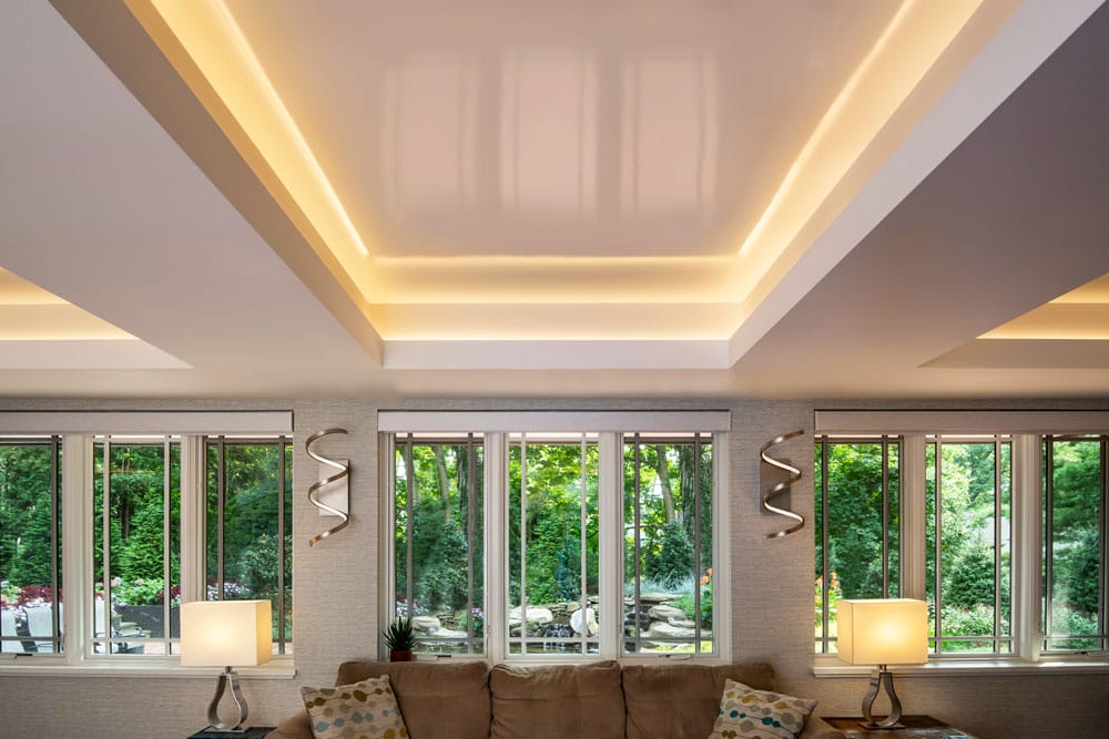
“We pushed up wherever we could from a low ceiling structure,” Gross says of the family room. “The ceiling treatment is highly reflective. We used a high-gloss lacquer and hidden cove lighting to create this look, which gives the illusion of multiple levels because of its reflectivity, though it’s only one recession into the ceiling. We employed this strategy to make the space feel more generous than it is.”
EDITOR’S NOTE: This story appeared under the headline “For Art’s Sake” in the October/November 2024 issue of Design NJ.
For more stories about updating split-level homes, see “Surmounting the Stereotype,” “Reworking a Split-Level Home in Livingston, NJ,” “Cherry Hill Challenge” and “Jersey Shore Vacation Home Presents Creative Opportunity.”


