Designer Injects Energy and Character into a Westfield Home
Writer Meg Fox | Photographer Vic Wahby | Designer Jessica Friedman | Location Westfield, NJHomeowners’ tastes and needs evolve since building the home over a decade ago
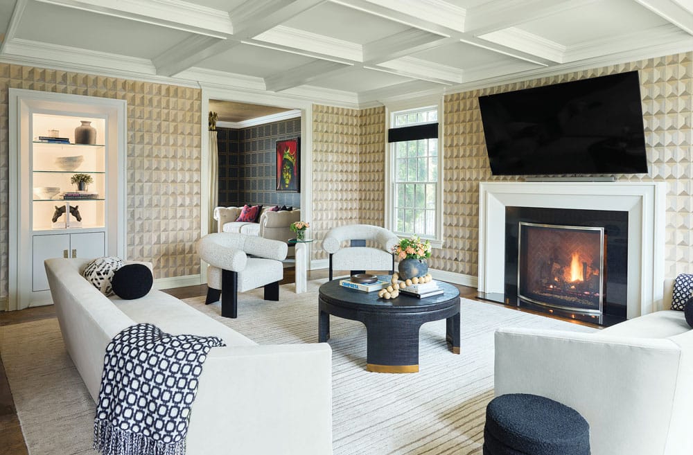
The family room was designed to be light and soothing with a contemporary flair, designer Jessica Friedman says. A dated fireplace surround was replaced with a streamlined version, and black accents tie it in with the adjacent living room.
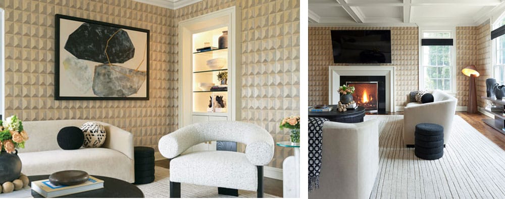
“The wall covering, crafted from real wood, replicates the look of coffered panels to create a captivating geometric effect,” Friedman says. “This provides a visually interesting backdrop for the solid upholstery pieces.” A large, unused window seat was removed to create a more open feel and improve the flow and efficiency of the seating arrangements.
‘My clients are a dynamic, vibrant, active family with two teenagers and two dogs who love to be at home when not traveling the globe,” designer Jessica Friedman says. Over a decade ago they custom-built and decorated their home, but as their tastes and lifestyle needs evolved, the interior needed a fresh perspective. “That’s when they brought me in,” says Friedman, owner of Westfield-based Jessica Friedman Interiors.
From the outset, the goal was to eliminate the mundane and inject distinct character into every room, Friedman recalls. “My clients envisioned a look that was not only unique and timeless, but one that also came with a captivating touch of wow.”
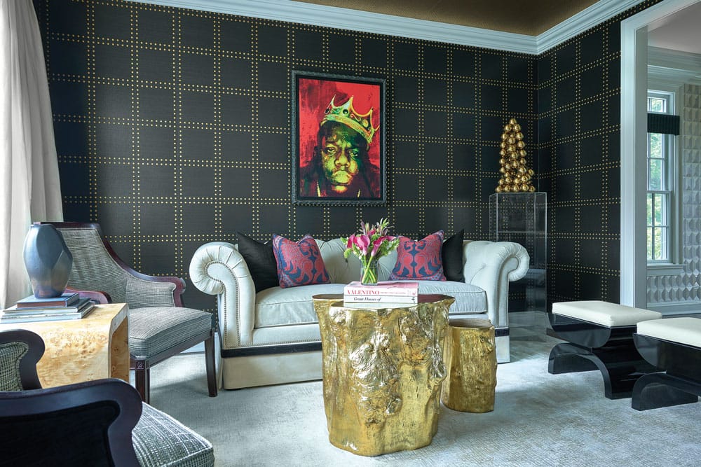
Infused with artwork from the homeowners’ personal collection, the living room blends existing furniture (some reupholstered) with contemporary pieces that give it a modern edge. Black grass-cloth wall covering — embellished with gold rivets — ties in with other gold accents for a cohesive feel.
The light-filled family room opens directly into the living room, inspiring Friedman to create individual but harmonious spaces with visual impact. The living room boasts a dark, moody ambience, whereas the family room embraces a light and soothing vibe with contemporary flair, Friedman explains. “To achieve balance, we introduced black accents into the brighter family room while incorporating lighter elements into the darker living room.”
Eliminating an off-center window seat that occupied valuable space in the family room allowed for a more efficient seating arrangement, significantly enhancing the room’s flow and functionality. The wall covering, designed to mimic coffered wood, uses real wood to create a captivating geometric effect. “This provides a visually interesting backdrop to the solid upholstery pieces, adding depth and interest to the space,” Friedman says. Additionally, an outdated fireplace façade was replaced with a sleeker, more streamlined design.
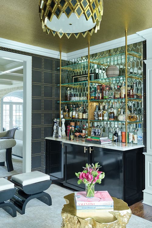
A focal-point bar enhances the living room’s functionality as a hub for entertaining. The sleek shape of the stools, with their black lacquer bases, aligns with the bar cabinetry’s custom finish.
The living room, often referred to as the bar room, is now a vibrant hub for entertaining. “The centerpiece is the bar,” Friedman says, with its striking black lacquer base, mirrored tile backsplash and custom brass shelving unit that extends from the ceiling. To create a sense of intimacy, they chose a black grass-cloth wall covering that’s embellished with gold rivets for the walls, complemented by gold woven wall covering on the ceiling. These design choices “beautifully tie in with the gold accents of the shelving unit and the cocktail tables, adding a cohesive feel,” she adds.
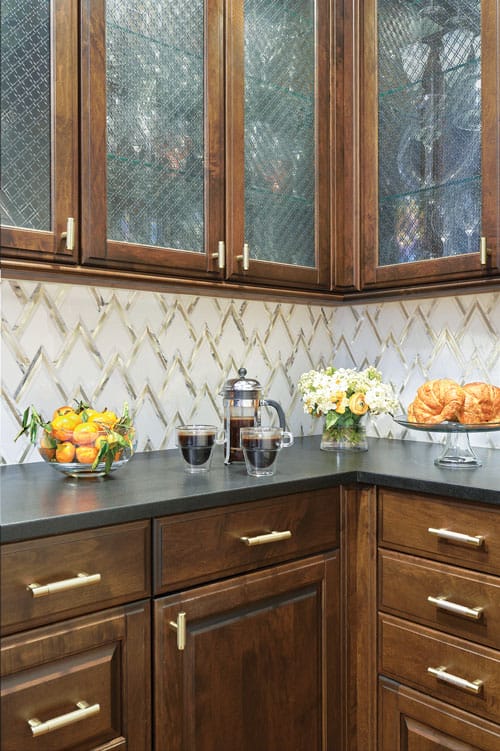
A geometric marble backsplash with gold inlay — accentuated by knurled gold hardware — adds a touch of glamour and sophistication to the butler’s pantry, which is located off the dining room.
Not all furnishings were replaced; some, like the existing living room sofa, were integrated into the redesign with a fresh twist: contrasting black tape trim along the sofa’s base that enhances its connection to the overall design scheme. Vintage living room chairs were reupholstered, and the antique dining table was retained in the dining room, adding a classic touch juxtaposed with contemporary dining chairs.
Situated on the opposite side of the home from the living and family rooms, the dining room has a distinct character that sets it apart from the other spaces. “It had been pale yellow for so long that my clients were excited for a change,” Friedman recalls. Enveloping the room in a deep blue scheme cozied up the room’s large proportions. “We chose a simple navy grass-cloth wall covering to add texture to the predominantly monochromatic space,” Friedman says. The walls and trim were then painted in a harmonizing blue satin finish. “It keeps the eye moving along.”
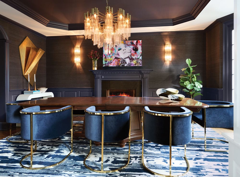
The dining room’s deep blue monochromatic palette and layers of texture create an evocative yet warm foundation, highlighted by gold accents. “We added that pop of cream on the ceiling for vertical color balance to pull out the cream in the rug,” Friedman says.
The cream hue of the area rug — the only patterned element in the room — “is repeated on the perimeter of the tray ceiling,” brightening the space and providing vertical color balance, Friedman notes. She adds that the custom Venetian glass sconces commissioned from Italy “perfectly complement the chandelier, creating a cohesive and elegant lighting design.”
This attention to detail and harmony flows seamlessly into the adjacent butler’s pantry featuring dark wood cabinets that pick up the dining table’s antique finish. “To introduce pattern and a touch of glam, we selected a geometric marble backsplash with gold inlay, adding a sophisticated touch to the space,” Friedman says. Coordinating knurled gold hardware kicks it up a notch, echoing the gold accents in the adjacent dining room.
“This project has been an absolute pleasure to work on, especially as we continue to work on the home and create a stunning jewel box of a powder room,” she says. “I deeply value the trust my clients have placed in me. Their confidence in me is something I have never taken for granted.”
EDTIOR’S NOTE: This story was originally published in the December 2024/January 2025 issue of Design NJ under the headline “Home Reimagined.”
For more stories about homes in Westfield, see “One of a Kind,” “Updating a Circa-1905 Home,” “Redesigned Dining Room Features Table Made by Homeowner” and “Noa Blake Design Adds a Warm Vibe at a New Home in Westfield.“
