Here To Stay
Writer Marirose Krall | Photographer Peter Rymwid | Designer Clodagh | Architect Jordan Rosenberg Architects & Associates, Jose Achi, Jose Jimenez | Builder Sopelsa Construction | Location Englewood, NJAn Englewood, NJ, home destroyed by fire is replaced with a minimalist masterpiece
Donald and Debbie Aronson have a zest for life that’s enviable. The couple are active in their community — Donald was mayor of Englewood, NJ, from 1989 to 1997 — passionate about their philanthropic efforts and enthusiastic about traveling the world. But when their home burned to the ground in 2011, they were very nearly overwhelmed. “Losing everything, it wasn’t tragic, but it was disruptive,” Debbie Aronson says. “It was exhausting.”
Still, the couple’s boundless energy won the day, and they enlisted a friend with whom they’d had a 20-year relationship — Clodagh, the internationally respected designer and CEO of Clodagh Design International in New York City. “I called Clodagh and asked if she was willing to do another house,” Aronson says. “If she had said no, I’m not sure we would have done the house at all.”
Fortunately, that wasn’t an issue, but the property was in a sorry state. Clodagh describes the gut-wrenching sight of the ruins. “When we drove by the first time, we saw this charred, sad wreck. It was unbelievable.”
Undaunted, the couple and Clodagh’s design team began the rebuilding process with the assistance of Jordan Rosenberg, principal of Jordan Rosenberg Architects & Associates in Ridgewood, New Jersey.
Clodagh points out one of the challenges they faced, “According to the code of the architectural planning board, we had to use exactly the same footprint. We couldn’t deviate half an inch.” As such, the new, modern residence takes up exactly the same space as the previous colonial style.
The straightforward, streamlined structure — all parallel lines and right angles — belies the complexity of the building mechanics. Rosenberg notes,
“Simplicity in life is a great virtue, but simplicity in architecture requires hard work and complex engineering to achieve. There are dozens of building systems hiding behind the walls, and at no time were any of them allowed to impair the intent or vision of minimalism for this home.”
They also couldn’t impair the views. When it came time to install the automated window shades, Clodagh told Rosenberg, “They all need to be recessed into the ceiling so when they are up, you see nothing.” Rosenberg handled the request by engineering a notch in the ceiling to hide the mechanics of the shade system. “The final result was clean lines that evoke the appearance of simplicity,” he says.
Simplicity wasn’t the only important element in the home’s design. Because of the Aronsons’ close relationship with the community, they also wanted a residence that will suit them for the long term, no matter what circumstances the coming years bring their way.
The home is equipped with an assortment of amenities designed to accommodate the aging process and diminish the possibility that the Aronsons would one day have to move to an assisted-living facility. For example, every door is wide enough for a wheelchair to pass through. There are no lips on any of the floors between rooms. “The microwave is in a drawer so you can sit in a wheelchair and use it,” Debbie Aronson says. Though the home does consist of two stories plus a basement, an elevator ensures easy access to every floor.
The Aronsons even considered the possibility that they may someday require live-in help. “Our fourth bedroom is a gym,” Donald Aronson says. That room is completely convertible into a caregiver’s quarters. It has a refrigerator, a cooktop and a shower,” he says, adding philosophically, “If you need a caregiver, you don’t need a gym. Those are my rules.”
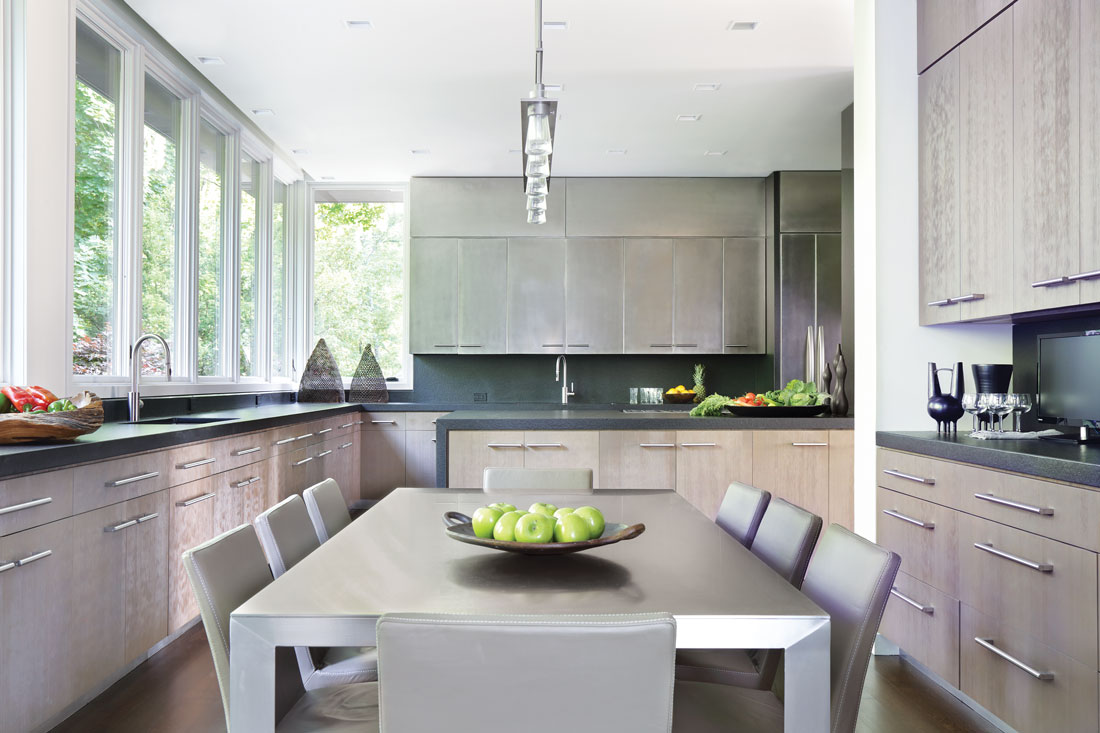
While the home is designed for future needs, it’s also designed for style and comfort in the here and now. A relaxed minimalism is apparent throughout the residence thanks in part to a subdued palette that promotes a tranquil atmosphere.
The unfussy décor is partly a result of abundant storage, which contains clutter yet remains nearly imperceptible. Clodagh, who encourages “life-enhancing minimalism,” designed cabinetry that blends into the space. In the kitchen, cabinet doors, unembellished save for handles, seem to recede into the background, letting the black granite countertops come to the forefront. The master bathroom cabinetry goes a step further, with no cabinet handles to interrupt the expanse of wood.
Lighting is an important design element in this home, and much of it comes naturally from dramatic floor-to-ceiling windows. “Light is life,” Clodagh says, and she took full advantage of the natural light by leaving the windows free of drapery.
The windows “bring the outside in and the inside out, weaving the two together,” the designer says. The earth tones throughout the home pair naturally with the constantly changing foliage outdoors.
The focus on the outdoors is an outgrowth of the “age-in-place” idea. Debbie Aronson points out, “As we get older, if we can’t get out, the outside gets in. No matter where you sit in the house, the outside is there.”
The harmony between interior and exterior permeates the residence, giving the modern structure a sense of warmth. “It seems homey and comfortable because we address all the senses,” Clodagh says.
The rebuilding process was a collaborative effort, Rosenberg says. “The interior designer, the architect and the contractor valued each others’ input, and we passed the metaphoric baton hundreds of times between us over the course of the project. It was a matter of playing off each others’ strengths and trusting that the end result would be a work of habitable art that everyone could be proud of.”
The Aronsons are certainly proud and pleased with their home. “It’s very livable,” she says. “It’s very low key. It’s efficient. It’s not dramatic or pretentious. It’s a very casual live-in house.”


