Makeover Adds Modern Industrial Flair at a Mendham Home
Writer Meg Fox | Photographer Mike Van Tassell | Designer Marissa Sauer & Lauren Collette | Location Mendham, NJ | Photos Styled Anna Molvik | General Contractor, Cabinetry & Millwork A.E. Ezmat Woodworking + DesignIngenious space solutions boost style and function in a Morris County remodel
CLICK HERE TO SIGN UP FOR OUR DESIGN DIGEST NEWSLETTER
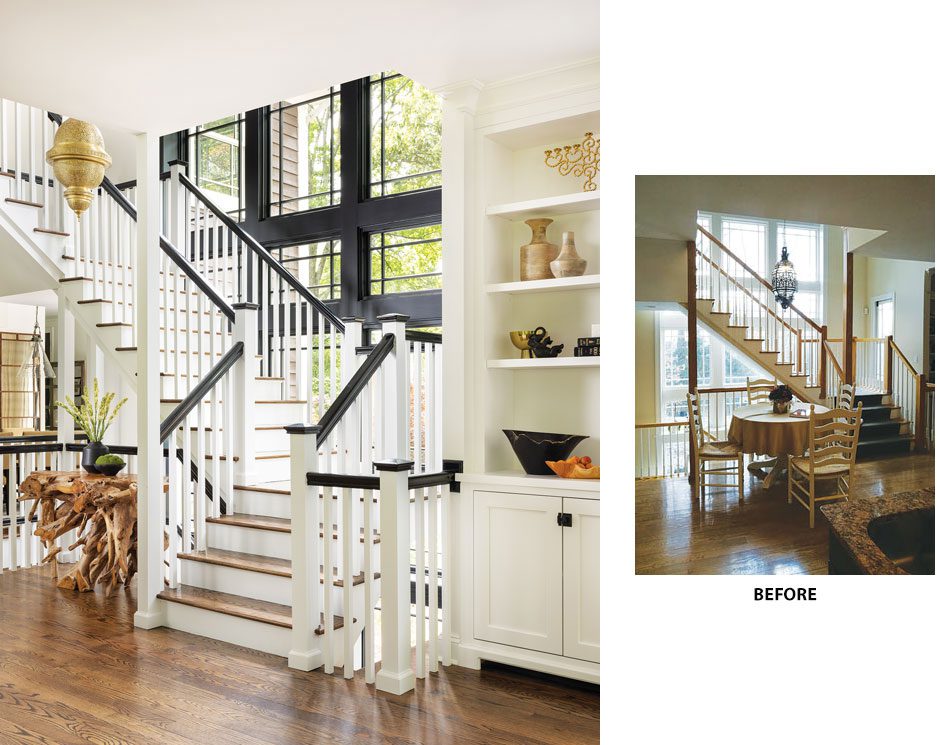
In the stairwell, existing Prairie-style window trim was painted black for emphasis. Together with new railings and posts, the transformation creates a “striking focal point” in the heart of the home, designer Marissa Sauer says. The Moroccan-style ceiling lamp is similar to one the homeowners purchased on their honeymoon in Morocco.
Tasked with a first-floor renovation of a Mendham home, designers Marissa Sauer and Lauren Collette sought to heighten the function and infuse a modern industrial flair to the kitchen, living area and adjacent spaces. Sauer is owner and lead designer with Design MACS in Franklin Lakes and Collette is a co-designer.
“The major challenge was a hallway running along the rear of the house that ended in the kitchen,” Sauer says. Annexing that hallway space led to key innovations, such as a custom blue apothecary-style cabinet in the kitchen that occupies space where the hallway entrance used to be. It also opened up space for a walk-in pantry that’s camouflaged behind paneled doors.
While updating the kitchen, which graced the cover of Design NJ’s February/March 2024 Kitchen Issue, the designers seized the opportunity to capture remaining hallway square footage to enlarge adjacent spaces, altering their orientation and access and even giving one room an entirely new purpose.
In the light-filled central staircase, the designers turned up the drama by painting the existing Prairie-style window trim black for a more modern feel. Posts and dated spindles were replaced, with rails painted crisp white. Adds Sauer: “The once mundane columns are now both visually appealing and practical, transcending from eyesores to elegant features.”
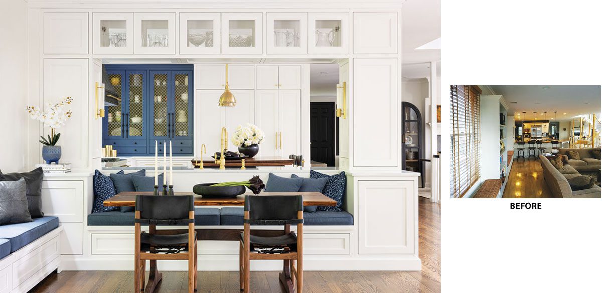
Reclaiming space from a former hallway off the kitchen made way for a blue apothecary-style cabinet and a storage-packed walk-in pantry concealed behind paneled doors. Custom built-ins framing the peninsula and banquette—with storage accessible from both sides — seamlessly integrate the kitchen with the living room. A space-efficient banquette is upholstered in high-performance fabric.
Highlighting the stairwell is a Moroccan ceiling lamp that replaced a similar one the homeowners purchased on their honeymoon in Morocco. “I like the things in my home to tell stories,” the wife says. The original lamp — purchased before they had a designated spot for it — “was never really the right size,” she recalls. Still, they “didn’t want to lose the sentiment” so they found a vendor in Morocco to handcraft a new one in proper scale.
“They did an amazing job on the detail work,” the homeowner says. It was a huge upgrade!” For Sauer, meaningful, historical connections like these “turn homes into a reflection of our adventures rather than just a collection of purchases.” Elsewhere, the designers incorporated Buster + Punch switches in almost every room within view. “These switches transcend the ordinary, elevating standard switch plates into genuine design elements rather than mere functional necessities,” she says.
Accommodating sufficient seating, storage and other features the clients desired in the kitchen and adjacent living area posed unique challenges. “Integrating an everyday kitchen table with sufficient space to function seemed unfeasible — until we incorporated it into the back of the kitchen peninsula,” Sauer says. A built-in banquette was another space-efficient solution because it allowed the custom table to sit closer to the wall. Built-ins surrounding the banquette and peninsula contain storage that’s accessible from both sides so family members can easily access dishware and other essentials while seated at the table.

Reconfiguring the layout and revamping the built-ins, among other upgrades, helped “transform the living room into a stylish and inviting space for the whole family to enjoy,” Sauer says. Blue and yellow accents, complementary colors found in the client’s beloved painting of “Blue Dog” by George Rodrigue (not shown), foster a sense of cohesion among rooms. Sofas sport elegant brass detailing, while a custom area rug grounds the room with its leather border and tailored dimensions. Another star in the room — the Massoud bench in front of the fireplace — is upholstered in three diverse performance-grade fabrics and textures.
To enhance style and function, built-ins in the living room were completely revamped and include such features as an integrated beverage fridge for easy entertaining and open shelving for cherished keepsakes. Window and door trim was painted black for a more modern look, echoing the details of the Prairie-style windows in the central staircase.
In the living room’s reconfigured layout, which blends seamlessly with the kitchen in a more open setting, the designers relocated the television above the fireplace “to consolidate the focal points,” Sauer notes. In the process, they brought in a reclaimed mantel for warmth and character. Blue and yellow accents, inspired by the client’s beloved painting of “Blue Dog” by George Rodrigue, inject vibrancy against a classic base of white, black and wood.
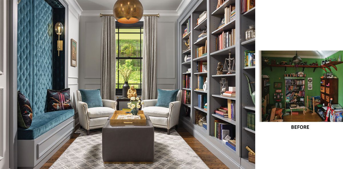
Converting a kids’ playroom into a sophisticated adult cocktail lounge and reading room “has given us an opportunity to have more grown-up space now that our boys are older,” the homeowner says.
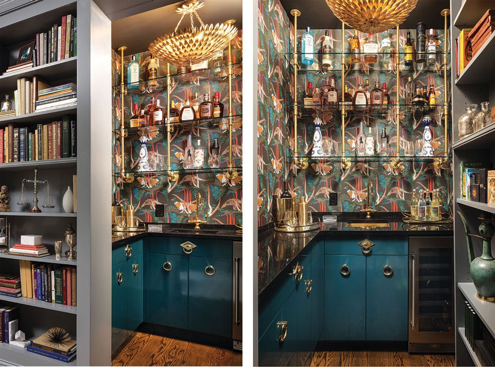
LEFT | “A concealed entrance to the cocktail bar adds intrigue,” Sauer says. “When you open the hidden door, the room reveals itself as a hidden gem, brimming with vibrancy and inviting you in to create the perfect cocktail.” RIGHT | Bar cabinets are painted “Blue Peacock” in a high-gloss, hand-polished mirror finish — a color cue taken from the vivid Pheasants wallpaper. Custom Porter ring cabinet pulls in polished brass have a labradorite inset, which brings an element of natural stone into the detail, Sauer notes. Bistro-inspired brass-and-glass shelving and a polished, unlacquered brass sink are highlighted by a black-painted ceiling and a polished Absolute Black granite countertop.
Shades of blue reappear in the cocktail lounge/library just down the hall. “Our goal was to transform a children’s playroom into a sophisticated adult space offering a retreat for relaxation, entertainment, specialty cocktails and reading,” Sauer says. One wall features a rich blue upholstered built-in banquette with a button-tufted back; another contains an expanse of built-ins that house the homeowners’ vast collection of books and artifacts. The room’s hidden gem? A concealed bookcase entry to a sophisticated cocktail bar “brimming with vibrancy and inviting you in to create the perfect cocktail,” Sauer says.
The nearby powder room was also reinvented — the layout pivoted 90 degrees after it absorbed square footage from a former hallway. “The expanded bath accommodates a stunning vanity and a generous distance around the toilet. It also serves as a canvas for showcasing unique tilework, bold wallpaper and elegant lighting,” Sauer says. “I think this may be our favorite bathroom we’ve designed thanks to its seamless mixture of materials and textures.”
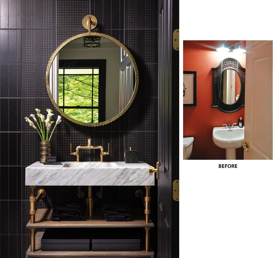
The enlarged powder room showcases statement pieces such as a handmade vanity and unique tilework that mimics industrial rivets on the main wall. “We carefully laid these out to ensure the fixtures could be centered on the alternating pattern of lines for balance,” Sauer explains. Other walls (not shown) are covered in luxe grasscloth. Marble flooring with intricate brass inlays from Artistic Tile (also not shown) “adds a touch of brightness and elegance to the otherwise sleek and moody room.”
The remodel in general “has given us an opportunity to have more grown-up space now that our boys are older,” their mom says, citing the cocktail lounge/library that became a new place to unwind after work. Beyond the additional storage, “we also love how fresh and updated everything looks. There are so many textures and little surprises everywhere, like the secret pantry door and the hidden bar behind the bookcase. The more you look, the more details you see, yet the space looks clean and uncluttered.”
EDITOR’S NOTES: To view more of the kitchen in this Mendham home, visit “Custom Blend.”
For another home with an modern industrial vibe, see “This Rumson, NJ, Home Blends All the Styles We Love.”
