Urban Chic
Writer Meg Fox | Photographer Rebecca McAlpin | Designer Hillary Cohen | Location Jersey City, NJA Jersey City loft rises to its design potential while embracing its industrial roots
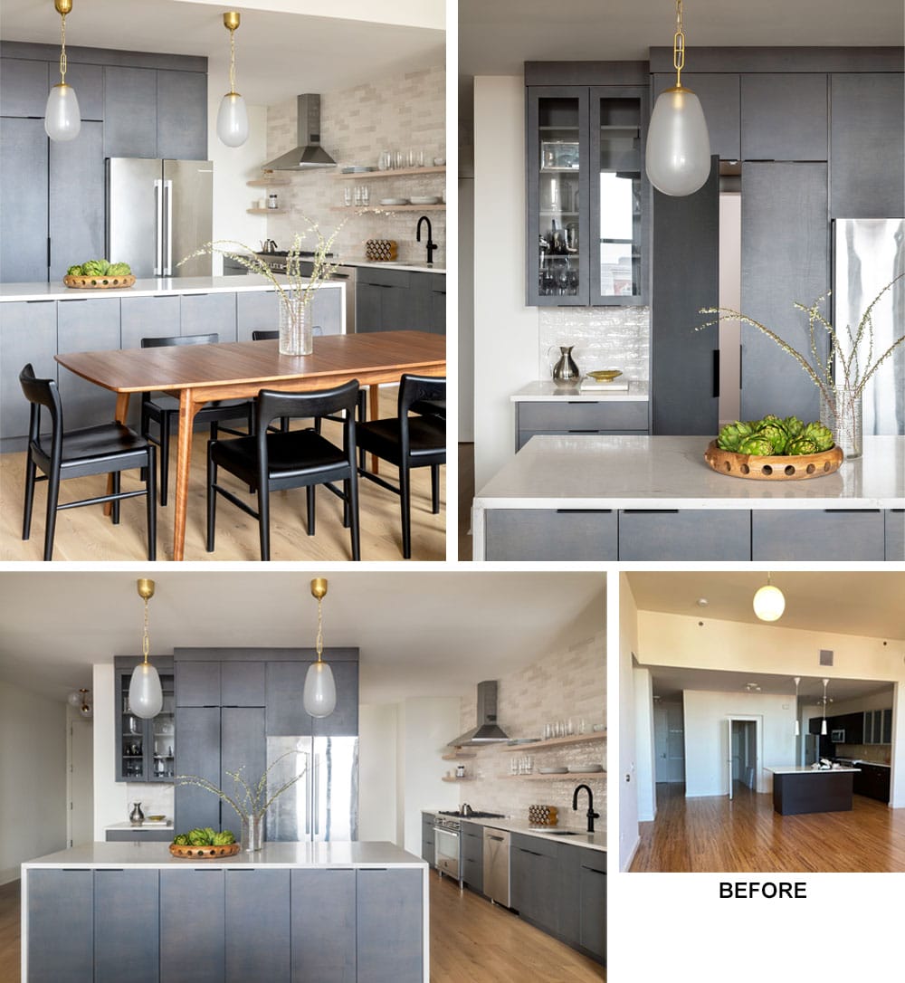
Top Left: Gray-stained maple cabinets in the expanded kitchen take on a streamlined feel with sleek and minimalist black edge pulls. Black accents lend cool contrast to the breakfast table’s warm wood finish. Brass lighting adds a bit of shine. | Top Right: A large closet along an underused stretch of wall space was converted into a second wall of cabinetry with a hidden walk-in pantry. Countertops are covered in Vadara quartz in Sereno Gold. “We loved the subtle veining, which had the perfect combination of warm and cool tones,” designer Hillary Cohen says. | Bottom: Cohen addressed the formerly unbalanced kitchen by increasing the size of the island and placing it in the center of the space. Upper cabinets gave way to floating oak shelves with a full-height glazed ceramic tile backsplash on the kitchen’s side wall.
Melissa Sepe-Johnston and husband Caleb Johnston loved the attributes of their downtown Jersey City apartment, located in the city’s vibrant and historic Hamilton Park neighborhood. Within walking distance to great restaurants, shops and beautiful Hamilton Park itself, “The area has all the benefits of living in a city but still has an amazing sense of community,” says interior designer Hillary Cohen, principal and founder of HCO Interiors in Basking Ridge.
When the young tech professionals outgrew their last apartment, they felt fortunate to be able to remain in the building but upgrade to a larger two-bedroom, two-bathroom unit. “They loved the space” the new apartment afforded, Cohen says. But they needed guidance on how to make an open space and awkward kitchen more functional, she adds.
The kitchen layout didn’t make sense, with cabinetry situated along a single wall, a tiny off-center island and a stretch of wall space incorporating a closet that went untapped, Cohen says. To use every square inch, Cohen converted the closet into an efficient and hidden walk-in pantry zone, which abuts additional cabinets and the newly relocated refrigerator. A second expanse of cabinetry containing the sink, oven, dishwasher and more occupies space on the main side wall.
The newly configured layout made way for an expanded, storage-packed island, which is now centered in the room. “The pantry space also allowed for a lot of kitchen storage so we could use open shelving on the main wall,” a feature the clients love, Cohen says. To emphasize the height of the 11-foot ceilings — “one of the best aspects of the apartment,” Cohen says — the design specified full-depth cabinets on one wall and a full-height shimmery glazed tile backsplash on the other.
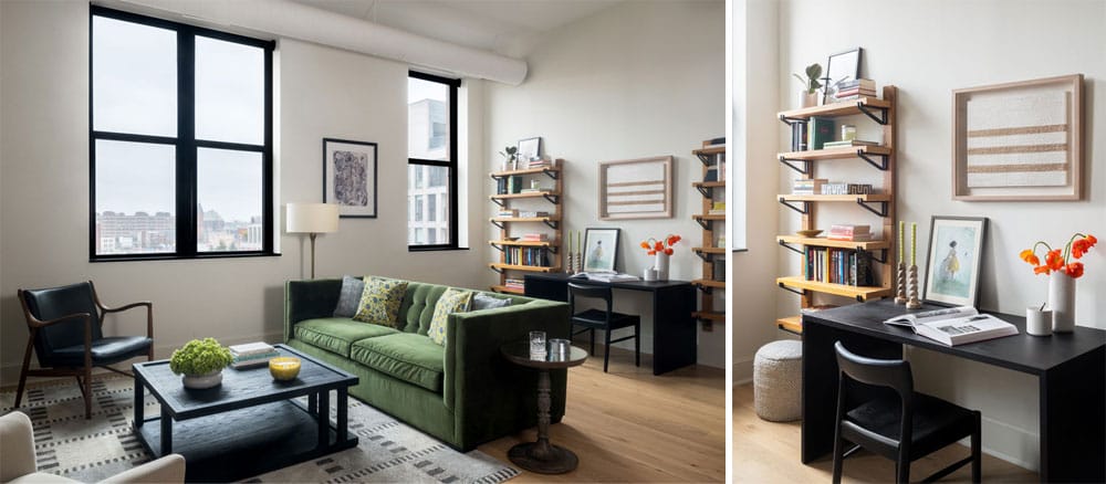
Left: A green velvet tufted sofa divides the living area from the workspace in the open-plan loft. “I like to think of it as eclectic,” Cohen says of the design scheme. “There are touches of Bohemian style and Midcentury pieces throughout that help give it a lot of personality.” Prized industrial features such as exposed galvanized steel airducts were softened with a white paint scheme that almost fades into the ceiling. In contrast, expansive window frames were painted black for emphasis. | Right: Wall-mounted oak shelves with metal brackets pair up with a black oak desk and chair.
Maple cabinets take on a furniture-like feel in a gray stain “that has a lot of movement and depth to the color,” Cohen says. White quartz countertops complement with subtle smoky gray and warm taupe veining, providing “the perfect combination of warm and cold tones,” Cohen says. Black edge pulls and a matte black faucet “attract as little attention as possible,” she adds, unlike the decorative brass and glass pendants “that almost look like pieces of jewelry” with their element of shine.
Considering the apartment’s unique industrial touches coupled with the clients’ love for modern design, “the challenge was to combine these styles to make a cohesive vision that still felt very warm and inviting,” just like the clients themselves, Cohen says.
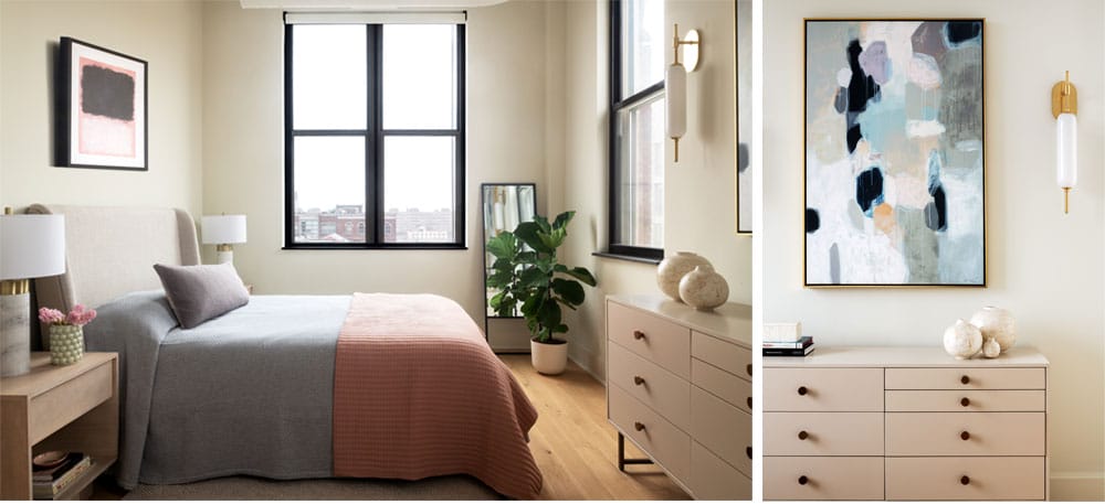
Left: “Having the bedcover go to the floor helped give the primary bedroom a sense of ease,” Cohen says. The soft pink throw pulls from the tones in the clients’ existing artwork. | Right: Graphic artwork over the dresser “blends the room’s neutral tones with a pop of color and intensity that balances the dark window frames,” Cohen says. Milk glass and brass sconces (one shown) further the room’s cozy ambience.
In the open-plan living area, Cohen crafted a library-like feel with wall-mounted oak shelves that contain exposed metal brackets to house the owners’ vast collection of books. And to play up the apartment’s expansive metal-framed windows, Cohen painted them in black, which “really made them pop.”
For welcome contrast, all walls were painted in “Dove Wing,” a creamy off-white tone that works with the warmth of the new wide-plank oak engineered wood floors that replaced dated, orange-toned bamboo flooring throughout. Coating the exposed silvery galvanized steel air ducts in white further lightened the space and made it feel more open.
A sumptuous button-tufted sofa — with the same height on the arms and back — helps divide the living space from the workspace. “The dark green velvet is a performance fabric, and I love the personality it injects into the room,” Cohen says. The furnishings reflect the owners’ eclectic tastes: a combination of Midcentury and modern, square and rounded, “to keep a sense of balance in the room,” she says.
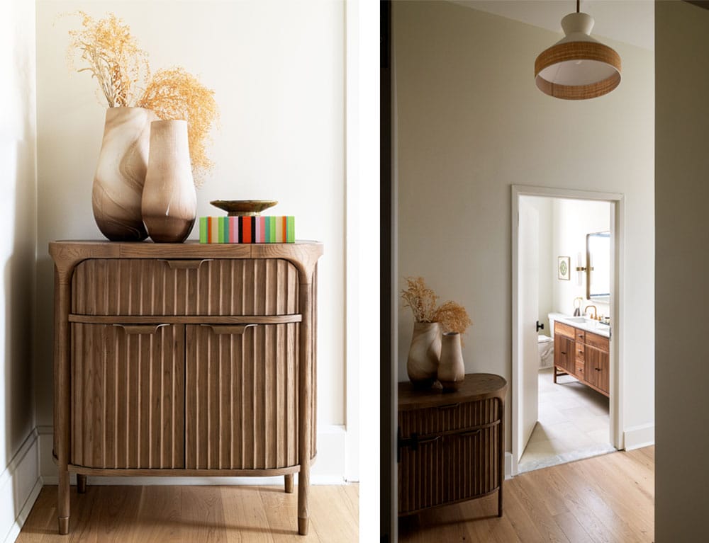
Left: The Isla Entryway Cabinet from Anthropologie has a classic silhouette with decorative steel detailing, rounded corners and textural wood. | Right: Modernized light fixtures such as this rattan-wrapped hallway chandelier replaced dated or lackluster lighting throughout. New engineered wide plank oak flooring also enhanced the loft’s aesthetic.
The primary bathroom, which formerly contained a separate tub and shower that ate up considerable wall space, was completely reimagined. The layout “didn’t make much sense, and the clients said they would never use the tub,” given that there was already another one in the second bathroom, Cohen recalls. Consequently, the space was gutted and reconfigured with a double walnut vanity and a roomy glass-enclosed shower with a sizable marble bench.
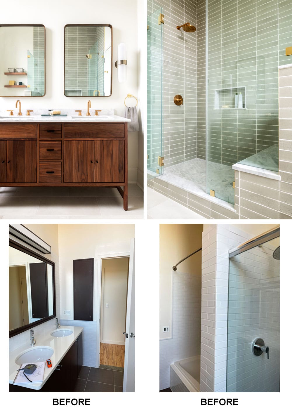
Top Left: “We gutted the primary bathroom, changed the layout and selected a unique combination of textures and finishes, Cohen says. Unlacquered brass plumbing fixtures and a rich walnut double vanity lend character to a once basic bathroom. The mirrors and sconces are in satin brass. | Top Right: Removing a wall that divided a confined bathtub and shower made room for an enlarged shower with marble-topped bench seating. Light sage glazed clay tile envelops the space with subtle color variation.
In the couple’s bedroom, Cohen used neutral tones for a feeling of serenity along with hushed blush hues. “As soon as I saw the artwork over the dresser, I knew it was perfect for the room,” Cohen says. “It blended the neutral tones with a pop of color and intensity that would balance the dark window frames. I like to use artwork to highlight the overall color scheme together in one place.”
