Blush Cabinets Add a Glow to a South Orange Kitchen
Writer Marirose Krall | Photographer Patricia Burke | Designer James Yarosh | Location South Orange, NJPale pink is the neutral among deep colors and wood tones

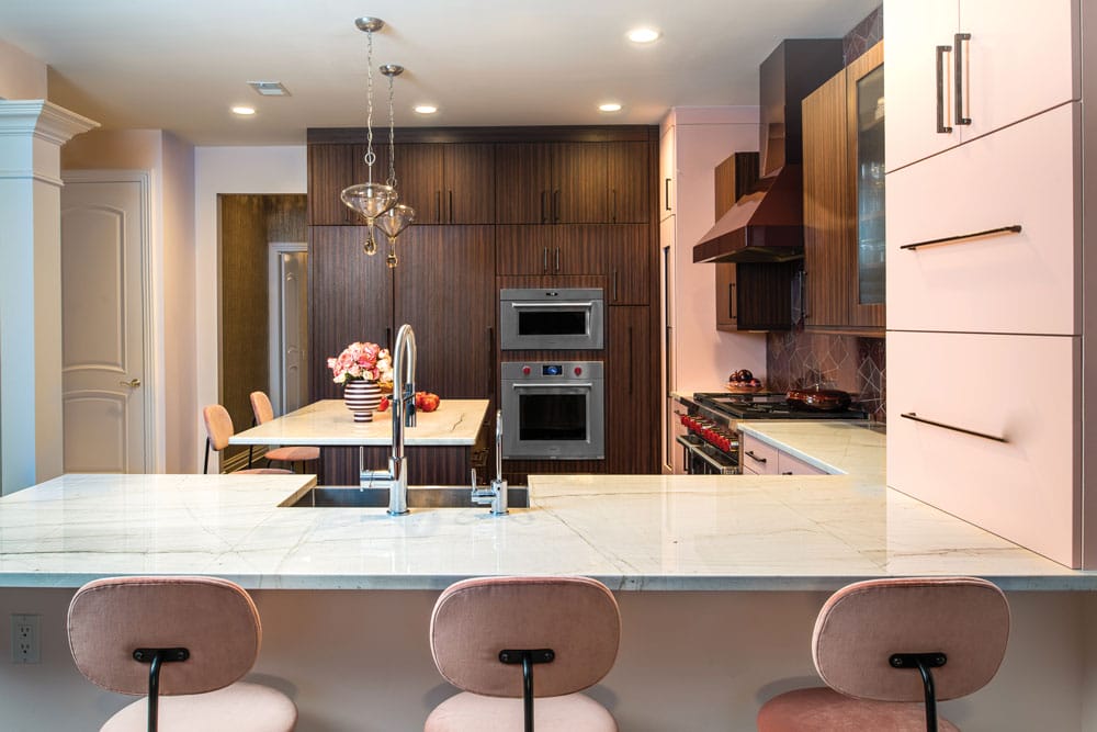
“I was afraid it was going to look very girly,” owner Ann Shuch says of her new kitchen. “But it’s unconventional, different and tasteful.” The hand-blown pendants above the island are from Shuch’s previous kitchen. “When James saw them, he said ‘keep the lights.’ I said ‘good,’ because everybody who walks in says they love those lights.”
“I saw my client as free, independent and a bit of a rock star,” James Yarosh says. “She is truly comfortable in her own skin.” For Yarosh, owner of Holmdel-based James Yarosh Associates Fine Art & Design Gallery, “this served as a jumping-off point for the design journey we explored together.” That journey involved a bold aesthetic that would harmonize with surrounding spaces. Homeowner Ann Shuch of South Orange explains, “I wanted something different, with kind of a cool vibe that jibed with the rest of my house.”
“The space had dark wood floors and her existing furniture was similarly dark and visually heavy,” Yarosh explains. Shuch adds, “I have lots of wood and shades of red, and the kitchen is the center of the house. I wanted something that would make a statement but, at the same time, work with the rest of the house. I was tired of white kitchens; I wanted color, I just didn’t know what color would work.”
Fortunately, Yarosh did. “When I first began to brainstorm ideas for the kitchen, I remembered seeing a blush-colored cabinet. It gave me the idea to use this as the ‘neutral’ for the kitchen against the deeper wood colors.” At first, Shuch was skeptical. “Pink wasn’t on my radar,” she says. “But James described his vision and I said, ‘I’m going to trust you.’”

“For the countertops, I chose a more neutral quartzite for its quietness and abstracted linear markings,” designer James Yarosh says. “In creating the wall of cabinets, I was pushing for a modern idea that would stand apart from the normal sets of upper and lower cabinets we so often see in kitchens. It proved to be functional and aesthetically bridges the contemporary and traditional styles of the space.”
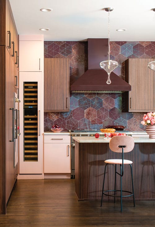
Shuch also trusted Yarosh with the choice of backsplash, a hand-picked selection of natural marble stones and glazed tile. “It’s a very strong hexagon tile that James scored,” she says, “so the additional grout lines make it look celestial.” The new rosewood cabinetry coordinates with the flooring. “It was a way of marrying the existing dark woods with something more sleek and hybrid,” Yarosh notes. Clear, teardrop-shaped pendants, retained from the homeowner’s previous kitchen, add another point of interest that works with the other elements without competing. “They bring in another texture without the distraction of additional colors or patterns,” Yarosh says.
An aubergine range hood reinforces the backsplash colors and contributes to the linear look of the space. “It smolders like a deep Bordeaux,” Yarosh says, “and creates an interesting visual dialogue with the vertical wine fridge to its left.” Shuch notes, “it’s a custom color. I think if it had been stainless steel, the kitchen wouldn’t have vibed the same. Again, James said ‘trust me.’ Everything that he led me to — all these strong elements — work together beautifully.”
“It’s a study in curated maximalism,” Yarosh shares. “I don’t view maximalism as excess, but as a means of celebrating the beauty that I see in the world and showcasing a life well-lived. Ann was looking for a marriage of old and new—something that would feel familiar to her and work with her existing traditional furniture while also speaking to her personal growth with more modern design elements. The design of the kitchen channels confidence and feminine strength, uplifting traditional undertones into a sleek and modern space.”
Though initially tentative about the colors, Shuch is more than pleased with the choices she and Yarosh made. “I have an open format in this house. When I’m sitting in my family room and look over at my kitchen, there’s a warmth and beauty that comes from it that makes me smile. James is a really great guy to work with. He has an incredible command of balancing colors and materials. That’s what drew me to him and I think it shows in this kitchen. He just has a way of making you see his vision. I’m so glad we did it. I love this kitchen every day.”
EDITOR’S NOTE: This story originally appeared in the February-March 2025 issue of Design NJ under the headline “Love at First Blush.”
For more about bold kitchens, see Double Vision; New Kitchen, Old Soul; Christopher Peacock on Luxury Kitchen Trends and Storm Photo Inspires Redesign of a Hoboken Brownstone.
