A Lackluster Hoboken Residence Gets a Fresh Look
Writer Marirose Krall | Photographer Shannon Dupre | Designer Kate Jacobowitz | Location Hoboken, NJThe transformed spaces have a Southern sensibility
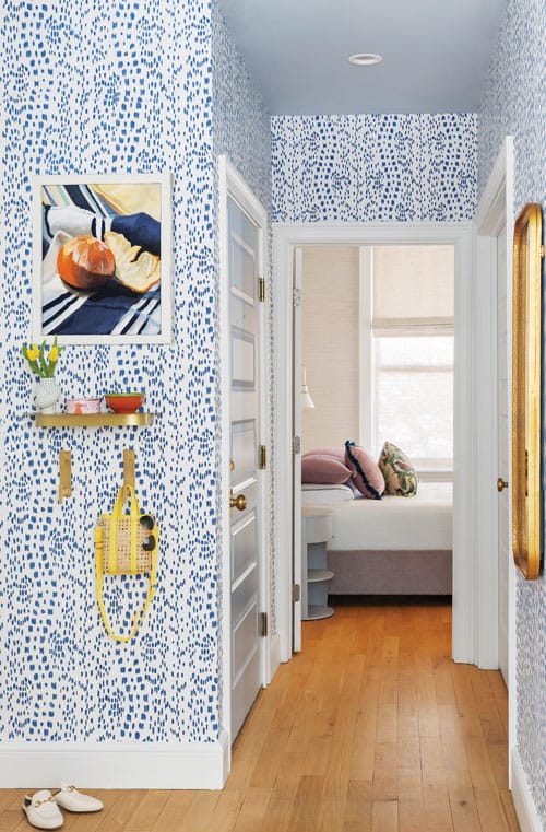
Cheerful blue wallpaper greets visitors in the entry. The original red oak floor was refinished in a lighter tone. “That was a bit of a challenge,” designer Kate Jacobowitz says. “We needed a fresh canvas and the brightness of the floor would set the tone for the entire space. We went back and forth on different finishes until we finally got it right.”
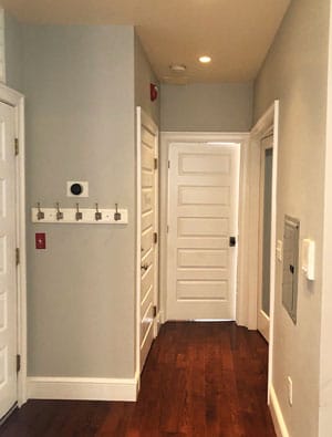
BEFORE
Homeowner Lynn Ehrlich knows potential when she sees it, and this Hoboken residence was fairly bursting with possibilities. “The home came with great bones,” she says. Indeed, the high ceilings, abundant windows and detailed millwork made this unit in a 1901 brownstone a real gem. Still, the home needed a facelift. “It came with an enormous amount of character, but it looked a bit dated,” Ehrlich notes.
Designer Kate Jacobowitz, of Livingston-based Kate Susannah Home, knew just how to liven up the place in a way that suited her client. “Lynn is from Charleston, so we wanted to bring a sense of ‘Southern charm’ to the space.” To create the look, the designer says, “We incorporated bright and whimsical patterns, fun colors, stripes and florals for an aesthetic that is cheerful and happy while also sophisticated.”
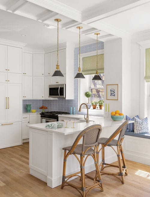
Patterned blue backsplash tile sets a spirited tone in the primarily white kitchen. The coffered ceiling is original.
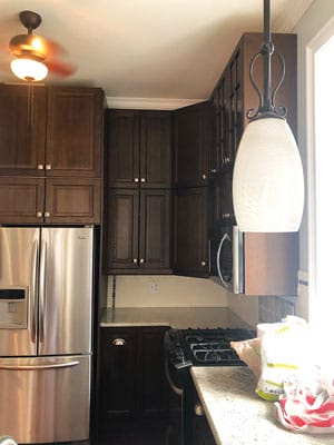
BEFORE
The effect begins in the foyer, formerly a blank canvas, where cheerful, blue-speckled wallpaper now greets those who enter. “Lynn loved this wallpaper and we just had to find a way to incorporate it,” Jacobowitz says. “It defines the entry and sets the tone as you walk in. It helps you understand the feel of the whole space.”
The kitchen, which is visible from the entry, required quite of bit of work to match the new aesthetic. “It was from the early 2000s — with dark wood cabinets and granite countertops. It felt really heavy,” the designer explains. The new space is the polar opposite — a bright, breezy room with pure white cabinets accented by lively blue backsplash tile. “The fun backsplash tile was the easiest decision and the catalyst for the whole design,” Jacobowitz says. Ehrlich agrees. “I didn’t want to go the safe, subway-tile route because that space sits in the middle of my house and I wanted it to be like sunshine. Kate came with different tile types; I saw this one with the zigzag pattern and thought ‘Oh my god, you’re in my head.’”
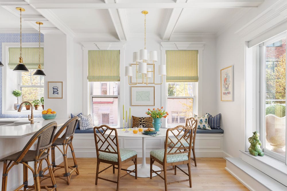
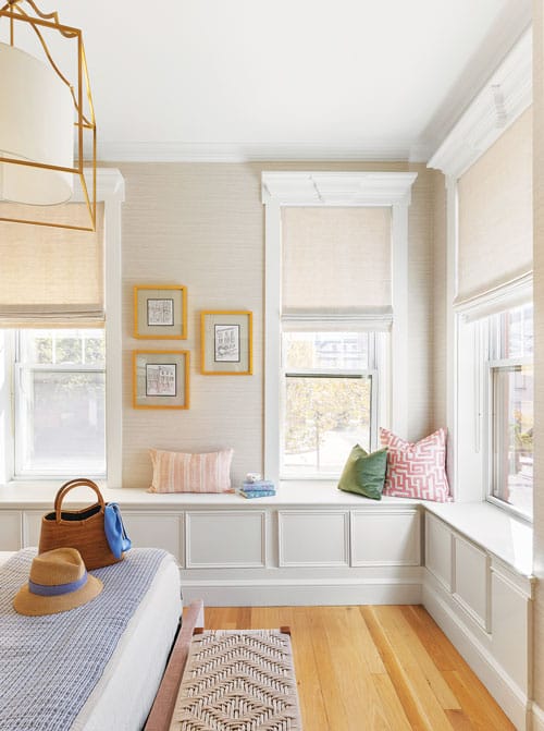
Chippendale-style chairs are situated around the table in the dining area. Jacobowitz added picture-frame molding to the window seats and, because this is a favorite spot for Ehrlich’s dog, Sunny, to relax, used hard-wearing vinyl fabric on the cushions.
BEFORE
A striped green window shade and black-and-gold light fixtures provide additional accents. “We let the backsplash, the window treatments and the pendants stand out on this clean canvas. The materials are timeless and will look great with whatever art Lynn chooses to add in the future.” Jacobowitz says.
The adjacent dining and living areas are also styled with bright colors against a neutral foundation. Of the living room, Ehrlich says, “I wanted it open and light — not cookie cutter, not matchy-matchy. And I knew I wanted a gallery wall to incorporate some artwork that’s important to me, including a poster from a Paris flea market and an original ‘Vogue’ magazine cover from the ’50s.”
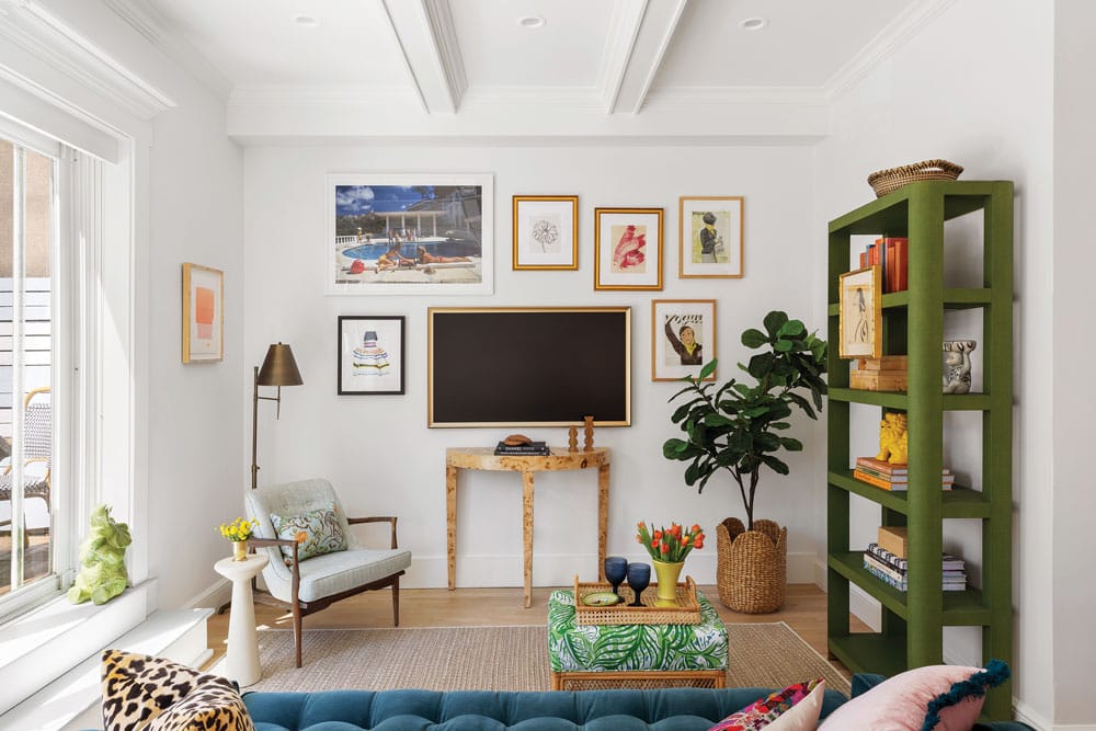
The living room features a gallery wall with some of Ehrlich’s favorite art pieces. The neutral walls and rug get a boost from the colorful furnishings. “Green is my favorite color,” the homeowner says, “so when Kate brought in that green bookshelf, it was perfect.”
The bedroom features muted, but still rich, tones. “We wanted it to feel more serene, but we still wanted to incorporate color,” Jacobowitz explains. “We used a blush tone for the bed. The walls are covered in linen-colored vinyl grass cloth. We integrated little punches of color in the pillows. The bedding can be changed seasonally and it will look great on the neutral backdrop.”
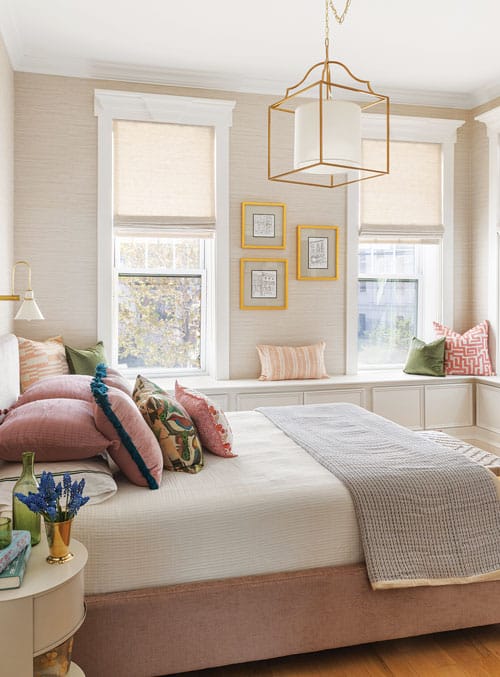
Softer tones in the primary bedroom create a serene atmosphere.
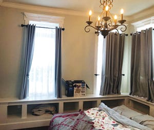
BEFORE
Jacobowitz added doors to formerly open cabinetry in the primary bedroom to contain clutter.
According to Jacobowitz and Ehrlich, the success of this project is due, in large part, to their easy collaboration. “We enjoyed the process so much,” the designer notes, “and that is definitely one of the keys to a project’s success.” Ehrlich adds, “I knew I wanted this home to feel like it had a breath of fresh air, but I wasn’t sure how to describe that to Kate. She just ‘got’ me. I would never have pulled together what she did, yet it was exactly what I wanted. That’s the benefit of using an expert. A designer can help you step out of your comfort zone. She created the perfect place for me. I appreciate it even more during these stressful times. I have a home where I feel happy.”
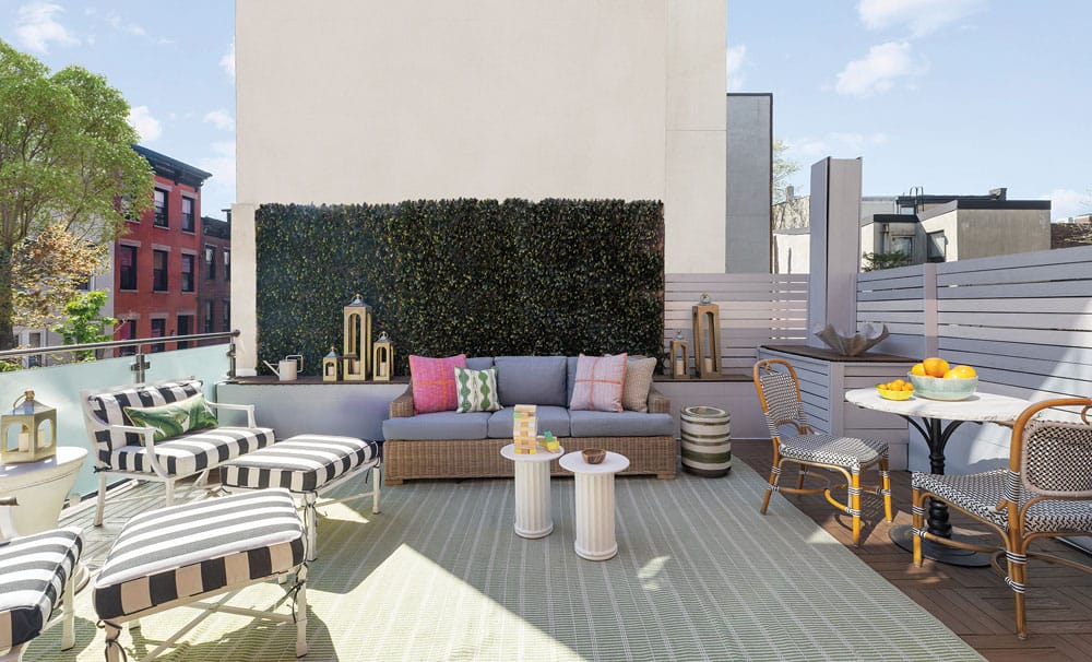
The unit has coveted outdoor space that Jacobowitz furnished with classic wicker elements and striped fabrics. Faux greenery covers the concrete wall of an adjacent building.
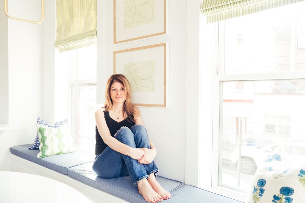
Homeowner Lynn Erlich enjoys a sunny window seat in her Hoboken home.
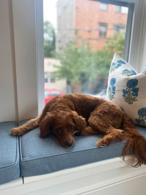
The window seats are favorites relaxation spots for Ehrlich’s Cavalier, Sunny.
EDITOR’S NOTE: This story first appeared under the headline “Southern Sensibility” in the June/July 2025 issue of Design NJ.
For more homes in Hoboken, see “Hoboken Apartment Building Updated into a Single-Family Home,” “Storm Photo Inspires Redesign of a Hoboken Brownstone,” “Shaker-Style Design in Hoboken,” “A Beautiful Hoboken Condo That Pleases the Entire Family” and “High Style.”