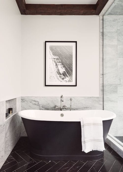
Hoboken Apartment Building Updated into a Single-Family Home
Writer Marirose Krall | Photographer Tory Williams | Designer Jenny Madden | Architect Jeff Jordan | Builder Coast Points Construction | Location Hoboken, NJThe new, loft-like spaces are stylish, sophisticated and imbued with warmth
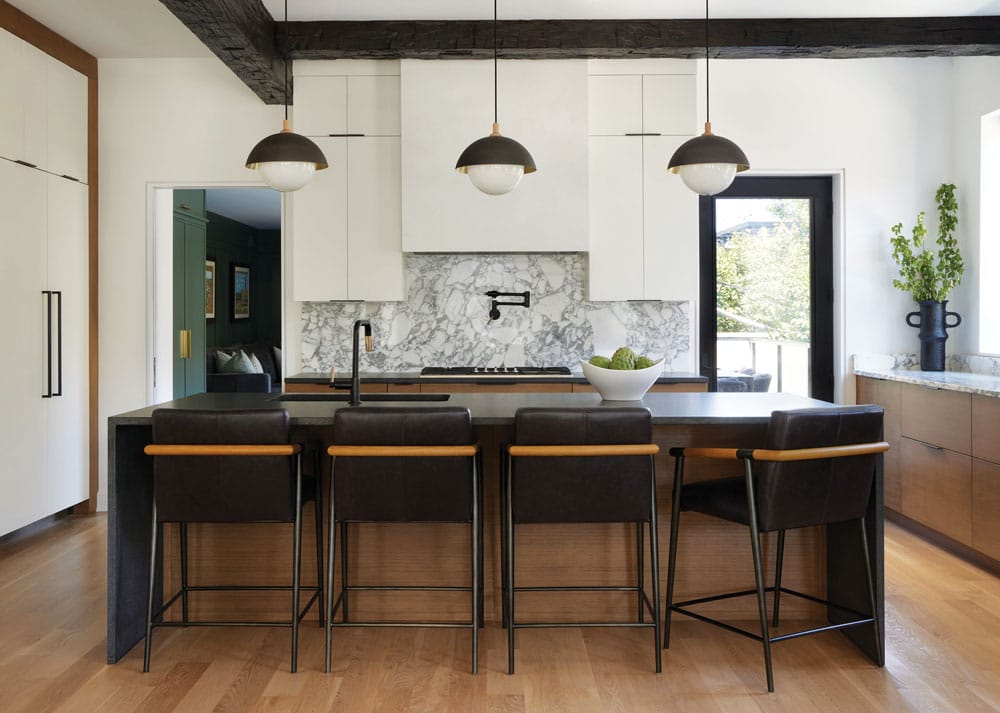
“Stone selection for the kitchen involved a balance of aesthetics and function,” designer Jenny Madden explains. “The homeowner loved the idea of using a dramatic marble in the kitchen, but concerns about durability ultimately won out. We chose a very sturdy, black honed granite for the island and next to the range and used the beautiful marble in the areas that don’t see as much traffic.”
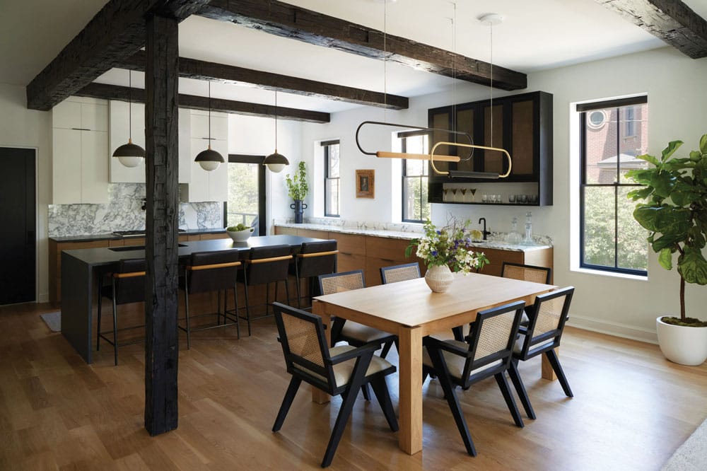
The light fixtures above the dining table are hung asymmetrically. “It’s not as straightforward as a typical chandelier,” Madden notes. “We offset them a bit from one another. It helps create some dynamic interest in the space, but also allows for a lot of connectivity to the living room because they’re so open — open but still interesting.”
Alicia Keenan and Jason Swankoski were drawn to their residence for two reasons. “The building has a two-car garage, which is rare in Hoboken,” Keenan explains. “In addition, our previous apartment was narrow and had minimal natural light; this building is located on the end of a city block, which allows for light to flow in from three sides.” Getting the place move-in ready, though, presented some complications: at the time that Keenan and Swankoski purchased it, the building was split into four apartments.
The new owners set about creating a one-family residence from disparate living spaces. Jeff Jordan, a member of the American Institute of Architects and principal of Jeff Jordan Architects in Rutherford, explains the extent of the project: “Basically every floor was reconsidered and gutted. We opened it up and added new plumbing and electrical systems.”
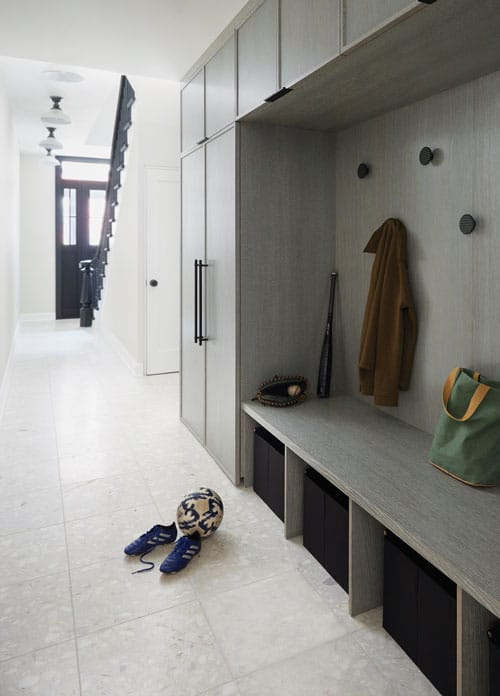
A mudroom space on the entry floor provides ample storage for jackets and sports equipment. The hallway leads from the front door to the garage.
For the interior design, the homeowners looked to Jenny Madden, of Westfield-based Jenny Madden Design, who along with her colleague, project designer Stephanie Murray, helped them to define their design tastes. “They were looking for a fresh look in line with their young, vibrant family — something between transitional and contemporary.” The dimensions of the space also helped to inform the design concept. “One of the great foundational elements here was the ceiling height — 10 feet — but we didn’t have much in the way of worthy, classical details. That led us to lean toward a SoHo loft aesthetic as opposed to historic brownstone.”
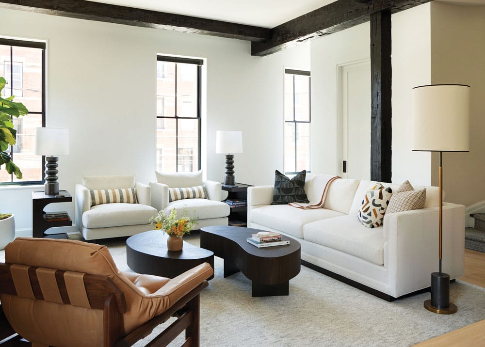
Madden wrapped existing columns in ebony-stained reclaimed wood and then added more beams to the ceiling. According to Madden, “the columns and the beams establish a design plan that feels integrated throughout that space.”
The loft look is evident on the second floor, which comprises the kitchen/dining/living room space. The airy, open layout boasts abundant natural light. A palette of white, brown and wood tones, accompanied by black accents, sets a sophisticated backdrop. A lounge chair in front of the fireplace adds Midcentury glamour, as does a fluted black terrazzo fireplace surround. “It helps to define the fireplace,” Madden says. “We capped it off almost at mantel height and transitioned to a plaster-wash finish above.”
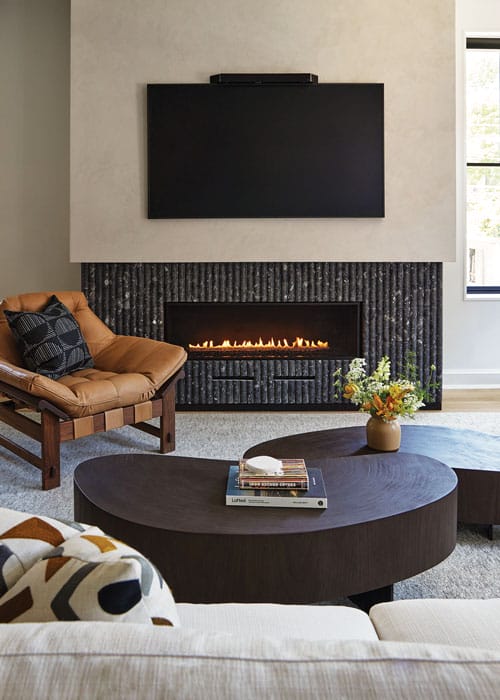
The living room fireplace features a fluted terrazzo surround. “It blends with the black gas fireplace box,” Madden notes. “Something about surrounding the box with another dark material softens it a bit.”
That finish is repeated in the kitchen’s range hood, which features a sleek silhouette that matches the flat-faced cabinetry surrounding it. A combination of white and oak cabinetry creates interest. The designer explains, “We wanted some warm wood in the kitchen. There’s a lot of black and white in the living room — the contrast is clean, it’s crisp, it really wakes you up. We needed to balance that with warm white oak on the island and base cabinets and on the floor.”
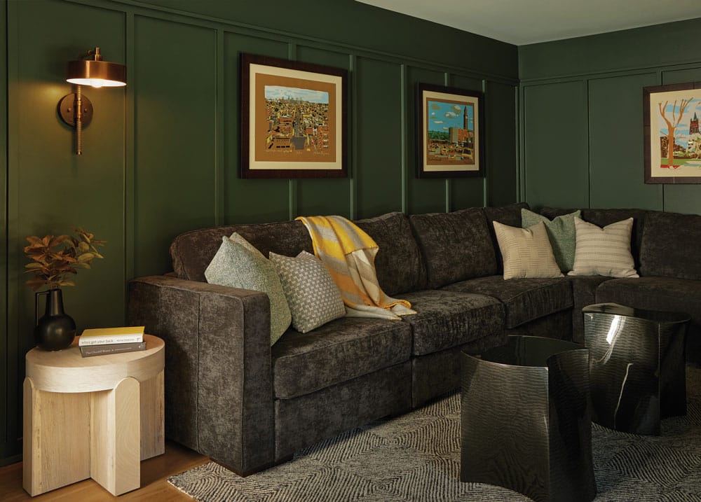
The family room is swathed in millwork painted deep green. “The fact that the clients wanted a neutral palette in the living room inspired us to get a little moodier in the smaller spaces.” Artwork is by Ricardo Roig, who has a gallery in Hoboken.
Richly stained wood columns and ceiling beams punctuate the rooms, defining the spaces and adding depth and texture. The beams were a matter of practicality as well as aesthetics. “They were the result of a challenge,” Madden explains. “We wanted a big, open space but there had to be several columns as well as a structural beam. We didn’t want those to feel forced, so we decided to embrace the structure and make that a feature. We found reclaimed wood that dated to the 1800s and had the structural steel beam and the columns wrapped in it. It adds the warmth we wanted and brings history and interest to the space.” Additional, purely decorative beams create a pattern across the ceiling. “It feels like they’ve always been there. They draw your eye up and create interest on the high ceiling in a way that is so much richer than a drywall ceiling would have been.”
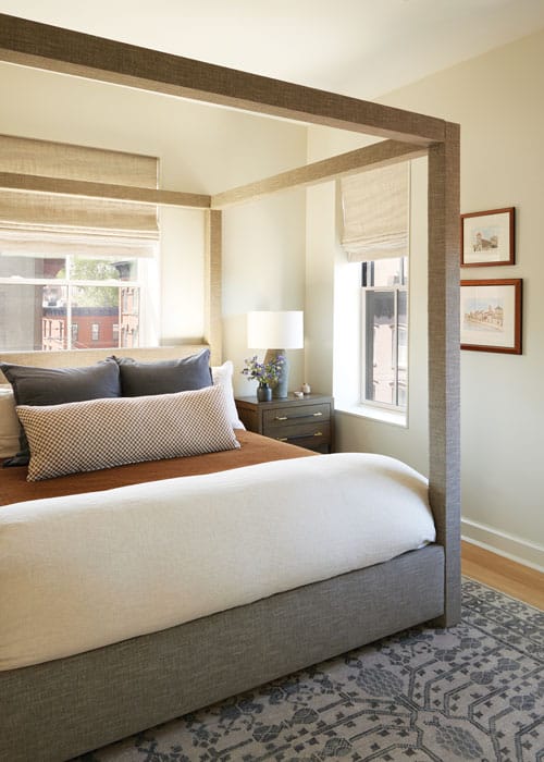
Moving the framed bed to the primary bedroom posed a challenge. “It’s always nerve-wracking to bring large pieces up three flights,” Madden says. The space is bright and airy with rust accents to warm it up. Motorized window treatments have sheer and blackout layers.
Just off the kitchen, the family room represents an aesthetic departure from the adjacent spaces. “With it’s lower ceiling height — 8 feet — there was no way it would feel as grand as the living room,” Madden says. “We leaned into that and created a different vibe.” The deep forest green walls are clad in board-and-batten paneling, and the furnishings include a comfy sectional sofa. “This is supposed to be the cozy family space,” she says.
And that’s just what the homeowners ordered. Keenan says, “We wanted to create a home where our family could grow comfortably, where we could create lasting memories. With the help of Jenny and her team, we chose finishes and fixtures that balance beauty with practicality, creating a space that feels warm and livable, sophisticated and inviting.”
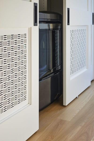
The laundry closet features custom vented panels. “It’s a little more elevated than a louvered door,” Madden says.
EDITOR’S NOTE: This story originally appeared in the December 2024/January 2025 issue of Design NJ under the headline “Out of Many, One.”
For stories about more homes in Hoboken, see “Storm Photo Inspires Redesign of a Hoboken Brownstone,” “Shaker-Style Design in Hoboken,” “A Beautiful Hoboken Condo That Pleases the Entire Family,” “High Style” and “The Bright Side.”

