Storm Photo Inspires Redesign of a Hoboken Brownstone
Writer Ren Miller | Photographer Tim Lenz | Designer Crystal Sinclair | Builder Ridge Restoration LLC | Location Hoboken, NJ | Styling Mariana Marcki MatosColors, textures and geometric shapes add moody, sexy character
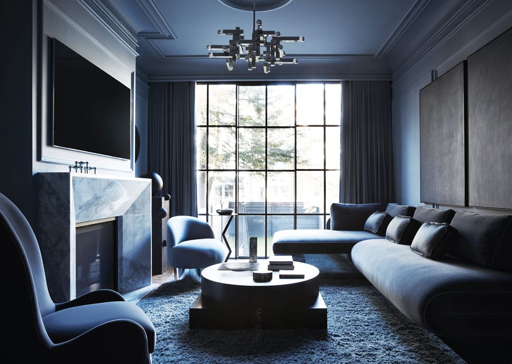
“The living room is painted in the most beautiful blue,” designer Crystal Sinclair says. “When you walk in, if you’re stressed, it just melts away.”
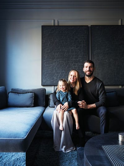
Homeowners Maggie and Ryan with their daughter Delaney in the living room. Daughter Bridget was born after this photo was taken.
Bad weather doesn’t usually bring good thoughts, but there’s something to be said for the hypnotic, calming patter of raindrops and the dark clouds that scoot us indoors where we feel safe.
Storms can even elicit ideas for home décor. A photo of a city storm gave designer Crystal Sinclair the idea to propose that theme to clients who had hired her to redesign their Hoboken brownstone. The clients, Maggie and Ryan, loved Sinclair’s idea to design each level of the 1901 brownstone as if they were looking at a different part of a storm, based partially on color palettes. The basement, for example, represents a rushing river (Hoboken being on the Hudson River) and is primarily teal.
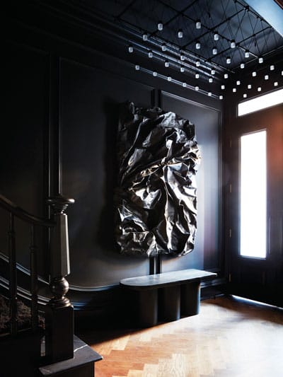
“The artwork looks soft,” designer Crystal Sinclair says, “but it is canvas that artist Rebecca Stern hardened, shaped and colored in black tones. Below it is a simple, modern bench and above is a ceiling fixture with shimmering lights that mimic stars.
The main level puts them under the clouds in rich blues with flashes of pink and gold like those seen just before and after a storm. The third level — comprising bedrooms and bathrooms — is in the clouds in dark blues and blacks. The top level rises above the clouds with sky blues and sunny golds.
The color story is overlaid with textures and geometric shapes that help to bring the rooms alive. “I love mixing the softness of a circle with the hard edges of a square because they balance each other,” says Sinclair, whose firm is Crystal Sinclair Designs in Tuxedo Park, New York. And because much of the brownstone’s character had been stripped away by previous owners, Sinclair designed extensive crown, ceiling and wall molding, which also lends a bit of Parisian atmosphere.
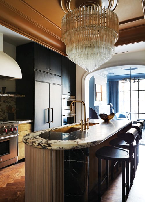
The kitchen is one of Maggie’s favorite rooms in the home. It features a crystal chandelier hanging from a goldtone ceiling and a white oak island with a Calacatta Viola marble countertop.
In addition to transforming the existing spaces, the home was enlarged at the rear to allow for a new living room on the main level, a primary bedroom above it and a nursery on the top floor. The home now totals a little over 2,750 square feet. Sinclair, who joined the project already in the framing stage, is quick to credit contractor Ridge Restoration LLC in Glen Ridge, for accommodating changes to the floor plan and the addition of details that she knew would restore character while also meeting modern-day needs.
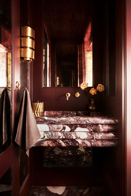
The main-floor powder room, another flash of deep pink in the storm color story, features Breccia Viola marble. It was fashioned into a vanity that looks like it has four gentle folds on the front. Sinclair specified mirrored paneling on two walls and painted the others in a deep shade that adds a touch of brown to the purplish red.
“When we first purchased the home,” owner Maggie recalls, “it had small windows, little closet space, only three bathrooms across four floors for five bedrooms, and dropped ceilings to provide limited AC and heat.” She and Ryan, who were moving from a one-bedroom condo in Hoboken as they started their family, wanted to add bathrooms and storage and to carve out spaces for an office, gym and other uses. “We didn’t want to open up all of the walls on the first floor to make it a completely open floor plan. We tried to preserve the original arches in the old living/dining space but relocated them to make the kitchen more central. Almost every room has built-ins for storage, but they are subtle and don’t compete with the design.”
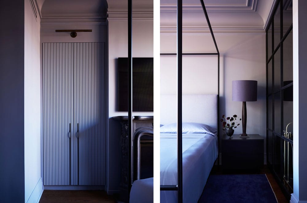
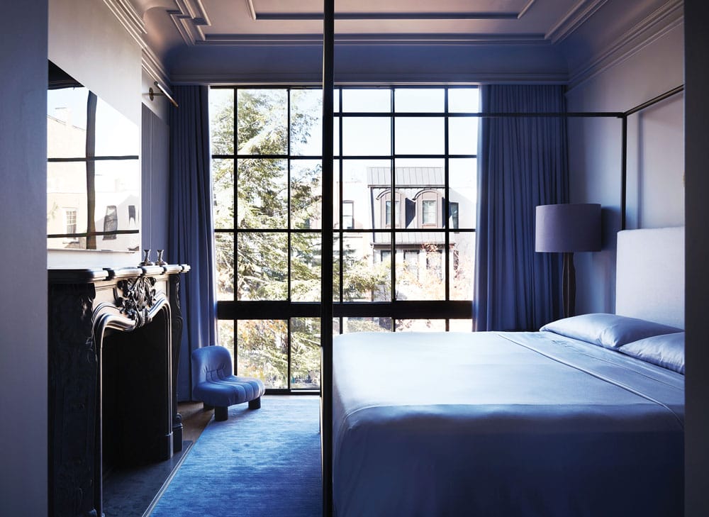
Fluted closet doors add a design element on both sides of the primary bedroom fireplace. The bed is flanked by night tables and lamps that complement the color palette.
They also wanted color. “We’re so tired of seeing all white and neutral spaces,” she says. “We wanted something moody and sexy but inviting.”
The front door, for example, opens to a small vestibule, which then opens to a foyer and stairwell dressed in black. A large work by artist Rebecca Stern sets the tone with its textures in shades of black, while a ceiling light fixture against the black background looks like shimmering stars. “It creates a really sweet moment when you walk under it,” the designer says. The herringbone flooring is white oak with a walnut finish.
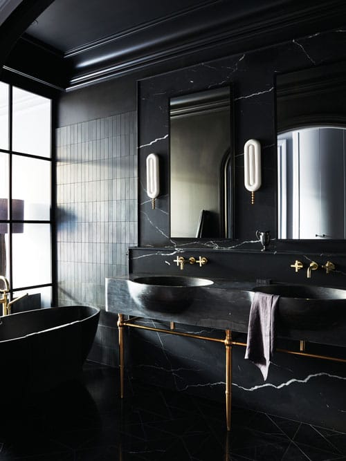
The solid wall between the primary bedroom and bathroom was replaced with a black-framed window wall (at left in photo), allowing daylight to reach the primarily black bathroom.
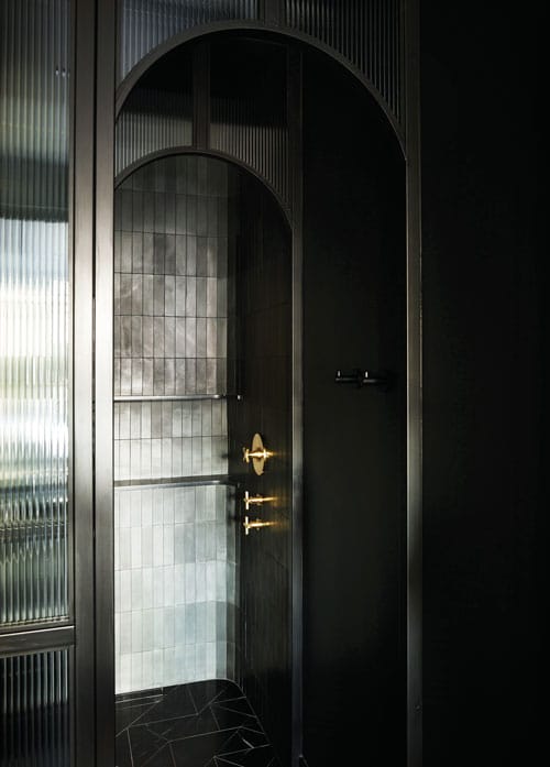
Tile in shades of black is installed vertically in the primary bathroom’s metal and glass shower enclosure.
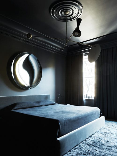
A convex mirror by Turkish designer Ali Yikin above the bed provides sparkle to the dark and moody guest room. “Metallic accents add zest, giving a dark room extra dimension and keeping it from being too drab,” Sinclair says.
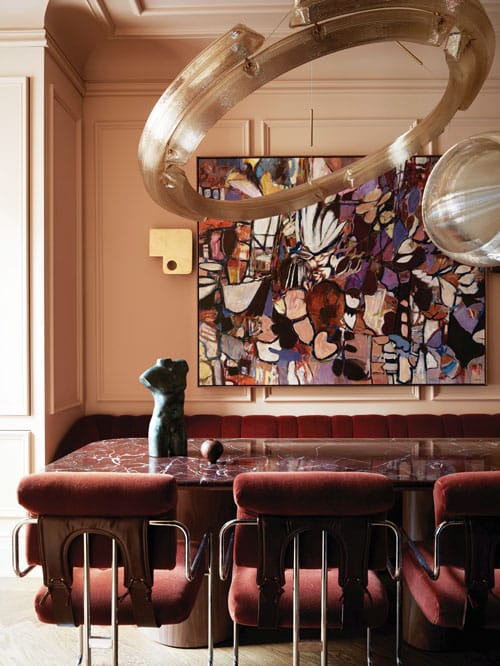
Just off the foyer, the dining room provides a flash of deep pink with subtle notes of peach under a futuristic chandelier by Dutch artist Dirk van der Kooij. The halo portion is composed of twinkling arcs of 3D-printed, high-grade recycled plastic. The smaller belted sphere is also 3D-printed recycled plastic. “It took parts of three days to hang the chandelier,” Sinclair recalls. “It’s heavy, and it was a challenge to get the right angle for the cantilevered halo.” Underneath is a dining table with a red marble top on a walnut base surrounded by a custom burgundy mohair banquette and vintage chairs reupholstered in burgundy velvet with leather supports. “The owners entertain often so they wanted a table that seats eight; two additional chairs can be pulled up to the table when needed,” she adds. An abstract painting by Seattle-based artist Christy Hopkins adds even more movement.
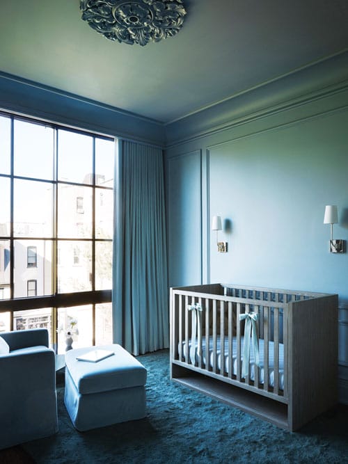
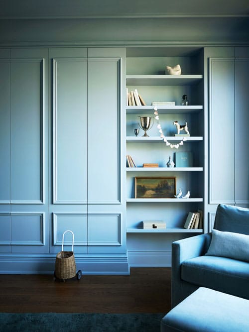
The homeowners didn’t want daughter Delaney’s room to be too feminine, the designer says. She chose a shade of gray paint that reads as blue and is soft enough to lean feminine.
The drama continues in the adjacent kitchen, which expands on the color story with flashes of gold thanks to a striking crystal chandelier hanging from a goldtone ceiling. “I knew the chandelier would have to be a showstopper to balance everything that’s going on below,” Sinclair says. That includes a design-intensive island with a white oak base and Calacatta Viola marble top. One end has a waterfall edge in marble while the other is rounded in fluted oak with a black marble column accent. Some of the perimeter cabinetry has a metallic brass finish while the rest is painted black. All in all, the kitchen is Maggie’s favorite space: “I love the function of the space, and the design is everything I could have dreamed of.”
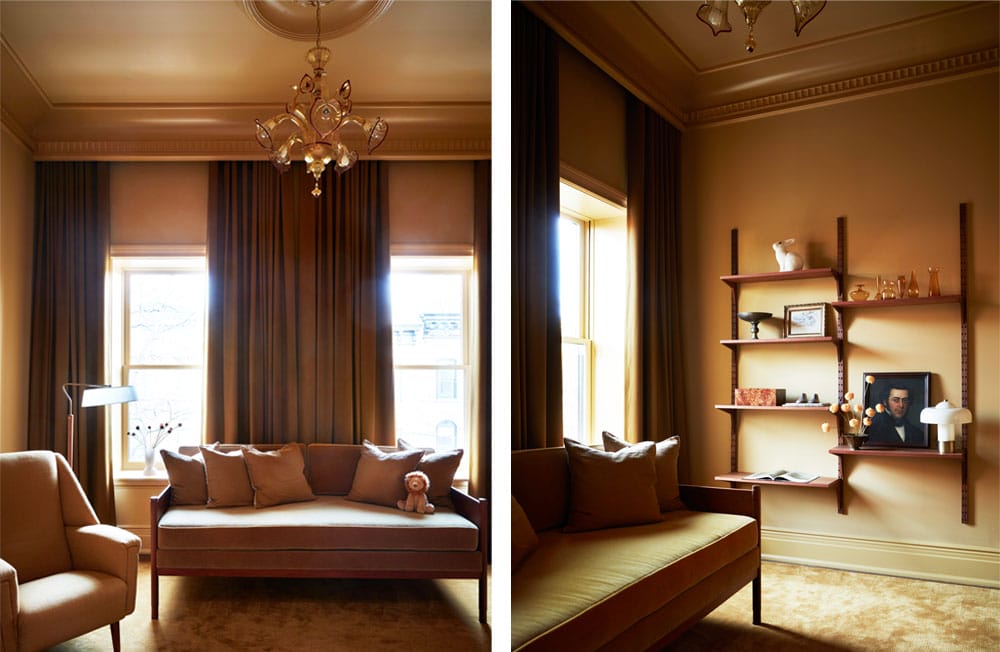
“This nursery, painted in a mustard yellow, is like the sunlight after the storm,” Sinclair says. “You walk into this room and you just brighten up.” Much of the furniture is vintage, including the daybed and chair that were reupholstered as well as the wall unit, ceiling light and floor lamp.
Beyond the kitchen, the living room is moodier in shades of blue and black that contrast shapes and textures. Sinclair designed a sofa with curved seat cushions covered in soft mohair over an angular brushed-brass base. The custom coffee table has a round top over a square base, and the angular, almost boxy ceiling light fixture balances an Andrew Jacobs sculpture featuring spheres cascading down a plinth. The two-part artwork in black above the sofa is by Warsaw, Poland-based artist Matthias Fabre. A textured rug pulls it all together.
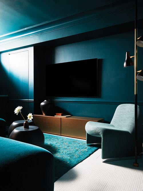
A cushy sofa and chair provide seating to watch television, play games or just relax in the teal-colored basement. Under the television, a custom brass console offers plenty of space to store games, while two spheres act as a coffee table, providing places to set beverages and snacks. The basement also includes a bathroom and gym (not pictured).
The storm theme moves upstairs — and into the proverbial clouds — in the primary bedroom, bathroom and guest suite. The primary bedroom is painted a soothing shade of gray with a lavender cast. “I’m a sucker for purple, and you rarely get to use it in a home,” Sinclair explains. Darker accents include the iron bed frame, Nero Marquina marble fireplace and, like elsewhere in the addition, black-framed, full-width windows. Closets hide behind fluted doors on both sides of the fireplace while custom night tables hold vintage lamps that came already outfitted with purple shades that fit perfectly into the palette.
The primary bathroom, meanwhile, is almost all black, but different shadings and textures keep it interesting. Black-framed windows that replaced a solid wall between the bathroom and bedroom provide natural light and create depth, Sinclair explains. The vanity ledge and sinks are Nero Marquina marble with brass legs that tie the bathroom in with other rooms that have brass accents. White sconces provide a flash of literal lighting and figurative lightening. Rectangular tiles in various shades of black are used vertically, suggesting a downpour, in the shower and two-thirds of the way up the wall behind the black bathtub (“only two-thirds so the space doesn’t feel claustrophobic,” the designer notes).
In a guest room, Sinclair used a rich charcoal shade for the walls because the room doesn’t get a lot of natural light. “If a room doesn’t have a lot of natural light, you can lean into the dark without it becoming depressing,” she says. “However, if a room has a lot of natural light, then it can look like you’re trying too hard to create a mood.” An oversized concave black mirror above the bed adds sparkle, and a light fixture that hangs from a ceiling medallion adds airiness and shapely interest.
The storm story concludes on the top floor, where sky blues and rich yellows suggest hovering above the clouds. The owners didn’t want anything too girly for Delaney, Sinclair says. They’ve since welcomed a second daughter, Bridget, and are awaiting the arrival of their third child in March.
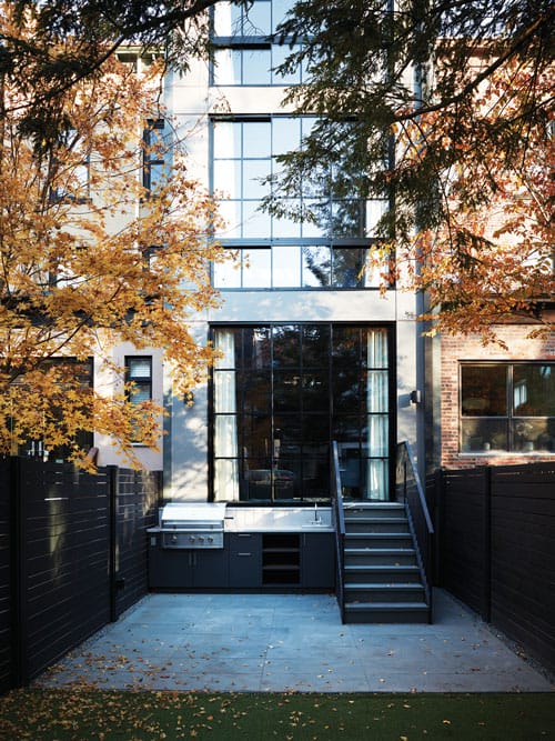
An addition at the back of the brownstone accommodates a living room on the main level, the primary bedroom above that, and a nursery on the top floor.
Are moody colors a risk? Maggie doesn’t think so. “I love the colors in the girls’ rooms; they just feel warm and inviting,” she says. “I also love the purple in our bedroom — it’s just so unique for a primary. I also love teal in the basement — it’s unexpected.” And thinking toward the future, although they have no plans to move, a future owner can easily repaint, but the brownstone hallmarks —arches, millwork, fireplaces and herringbone floor s—will remain.
EDITOR’S NOTE: This story originally appeared in the December 2024/January 2025 issue of Design NJ under the headline “Calm in the Storm.”
For stories about more homes in Hoboken, see “Hoboken Apartment Building Updated into a Single-Family Home,” “Shaker-Style Design in Hoboken,” “A Beautiful Hoboken Condo That Pleases the Entire Family,” “High Style” and “The Bright Side.”

